WGSN and Coloro present their Key Colors for A/W 24/25, which are aligned with influences that will drive consumers, including a focus on wellbeing, creativity, the environment and technology.
WGSN, the global authority on consumer and design trends, and Coloro, the global authority on the future of color, today announced the colors that will be adopted by 2025.
As consumers continue to grapple with ongoing economic, political and environmental crises, a sense of uncertainty about the future will remain a dominant force. As a result, our Global Color Forecast aligns with influences that will drive consumers as we head into 2025, including wellbeing, creativity, the environment and technology.
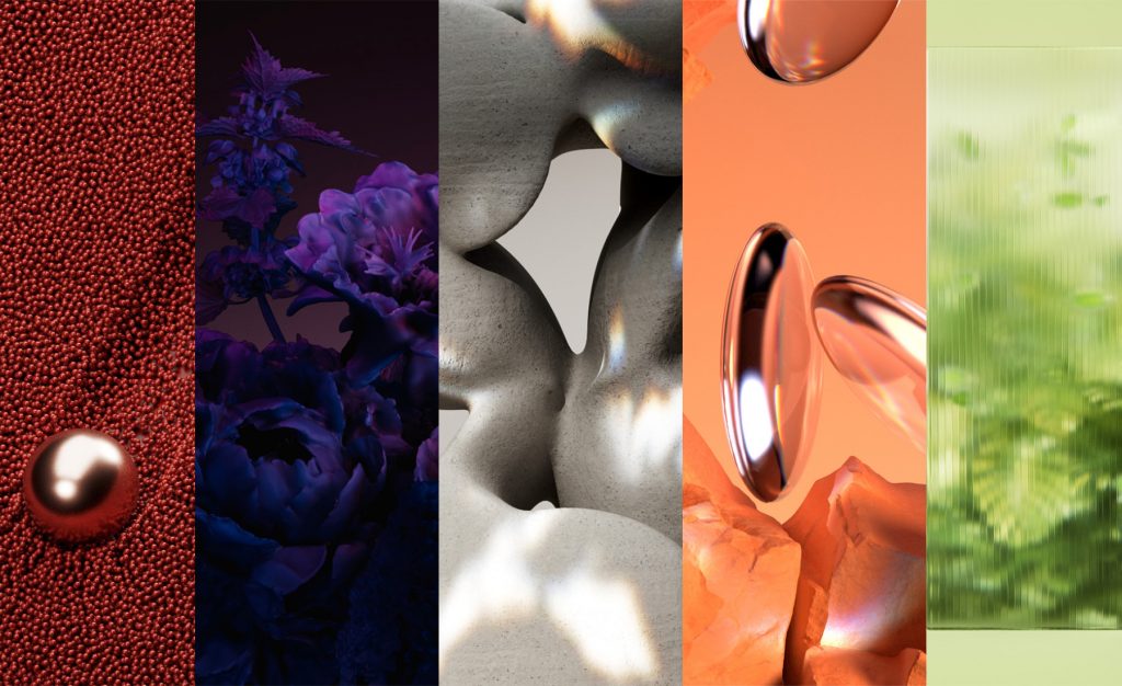
Image courtesy of WGSN.
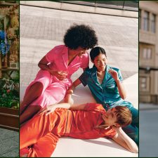
The Key Colors for A/W 24/25 are Intense Rust, Midnight Plum, Sustained Grey, Cool Matcha and Apricot Crush.
Clare Smith, Colour Strategist for WGSN, said: “Our key colours for A/W 24/25 reflect the need for stability, escapism and restoration. As consumers remain sensitive and cautious about the future, there is a need for colours to do more and we see shades that offer stability and reassurance come to the forefront. In contrast to these timeless and grounding shades, colours that connect to nature and wellbeing remain key, with these restorative shades bringing a sense of calm and tranquility to the season. Finally, a sense of escapism sees the return of colours that can morph effortlessly between physical and digital realms”.
Smith added, “These versatile shades have transpersonal appeal, which reflect the importance of choosing colour responsibly, and we expect them to transcend into 2024/25. These shades can also work in perfect harmony with each other and can create a complementary palette when used together”.
Sansan Chen, Managing Director of Coloro, the innovative colour system used in the forecast, said: “Our mission to achieve responsible colour is evident in three ways. One, we expect these shades will have long lasting appeal, transcending multiple seasons into 2024-25. Two, Coloro’s system of organising colours by hue, lightness and chroma ensures these shades can work in perfect harmony and are complementary. Three, the Key Colours have gone through Coloro’s Health Check to confirm each is highly achievable with good testing results on multiple substrates including polyester, cotton and nylon. This ensures businesses aren’t wasting time or resources on colours that aren’t feasible.”
Color of the Year 2024: Apricot Crush – 02465-27

Color of the Year 2024: Apricot Crush – 02465-27
Image courtesy of WGSN.
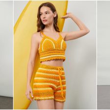
WGSN first forecast Apricot Crush as a key color for A/W 23/24, aligning with a focus on balanced lifestyles that nourish the body and mind. Moving it into Colour of the Year 2024 signifies the importance of orange as a versatile, transseasonal shade. Reflecting WGSN’s commitment to colour longevity and sustainability goals, Apricot Crush’s restorative attributes will appeal across fashion, beauty, interiors and consumer tech.
This balancing bright is an activating vitamin tone that embodies a full spectrum approach to health and wellbeing. Encompassing the natural vitamin- and antioxidant-rich benefits of apricots and oranges, it also draws from the beauty found in nature. Through times of so much uncertainty, Apricot Crush continues to confirm its importance, acting as a color full of hope and positivity.
Intense Rust – 015-33-25
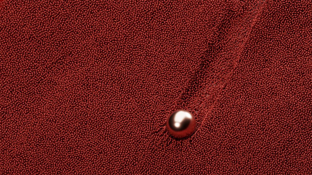
Intense Rust – 015-33-25. Image courtesy of WGSN.
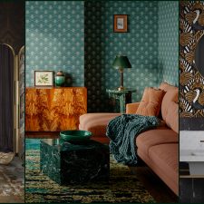
First forecast for A/W 23/24, Intense Rust returns to the palette for A/W 24/25 as a key color. The warm and rich shade of Intense Rust is a transseasonal brown that evokes feelings of stability. Balancing luxury with a raw, earthy edge, this colour is reminiscent of soil, full of warmth and calm textures. It’s inspired by consumers increasingly valuing sustainability over newness, re-sale culture and products with long-term appeal. This color communicates authenticity, quiet luxury and promotes a return of classic design.
Midnight Plum – 151-22-09
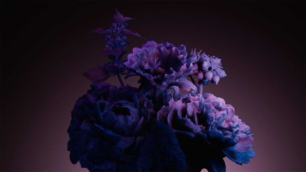
Midnight Plum – 151-22-09. Image courtesy of WGSN.
Midnight Plum is a powerful dark purple that connects to themes of space exploration and the metaverse. NASA’s James Webb Telescope images opened up the possibility to unravel mysteries about the origins of the universe, allowing colours in space to capture our imaginations. A tinted dark close to black, this colour celebrates darkness, connecting to a sense of mystery as well as gothic and underground sentiments. It aligns with the increasing consumer desire for escapism.
Sustained Grey – 035-73-04

Sustained Grey – 035-73-04. Image courtesy of WGSN.
Sustained Grey confirms the continuing importance of neutrals and more sustainable colour choices, which celebrates recyclability and the pursuit of ‘just enough’. Representing practicality and reliability, this colour is foundational and grounding with a utilitarian edge. It speaks to promoting balance and slowing down, as a timeless shade with transseasonal and long-term appeal.
Cool Matcha – 055-85-20
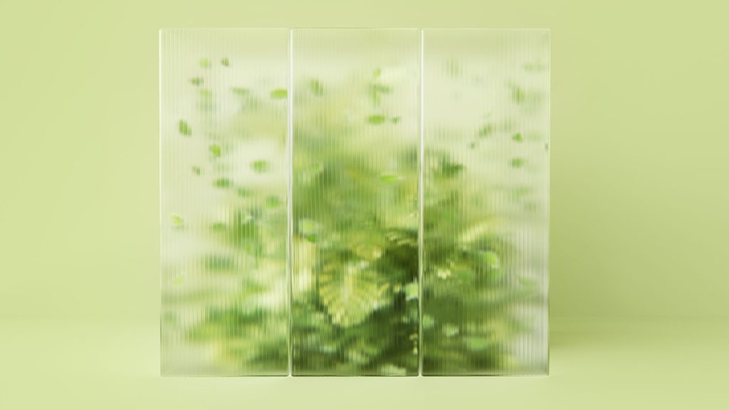
Cool Matcha – 055-85-20. Image courtesy of WGSN.
Cool Matcha is a tinted pastel with a soothing and calm quality. Connecting both nature and technology, it highlights the importance of developments in nature-powered bio and plant-based materials, dyes, pigments and energy sources. As consumers continue to deal with feelings of anxiety and stress, we look to colour to help soothe the mind and bring a sense of rest and reflection. Cool Matcha is a quiet, pacifying pale with a therapeutic quality and is the perfect combination of a vegetal green and mindful pastel.
WGSN – www.wgsn.com
WGSN is the global authority on consumer and design trends, helping brands across the globe create the right products at the right time for tomorrow’s consumer. Our trusted consumer and design forecasts power outstanding product design, enabling our customers to build a better future in the digital economy. We do this by constantly monitoring the signals of change that we know will impact how consumers think, feel and behave. Our experts then connect the dots to accurately predict the products, experiences and services people will need in years to come. We have been getting it right for over twenty years, helping the leading brands in 23 major consumer industries create resilient businesses.
Coloro – coloro.com
Coloro is a truly universal, intelligent and logical color system that allows fast and accurate communication throughout the color process and supply chain. A sister brand of WGSN, Coloro helps reduce waste and time in color decision-making and manufacturing by bringing creativity and science together. Coloro was created through collaboration with leading global textile and fashion companies. Coloro’s extensive library of 3,500 contemporary colors can be accessed through color books, and by purchasing swatches online. A free digital color tool, the Workspace, is also available on coloro.com
Ascential – www.ascential.com
Ascential delivers specialist information, analytics and ecommerce optimisation platforms to the world’s leading consumer brands and their ecosystems.
Our world-class businesses improve performance and solve problems for our customers by delivering immediately actionable information combined with visionary longer-term thinking across Digital Commerce, Product Design and Marketing. We also serve customers across Retail & Financial Services.
With more than 2,000 employees across five continents, we combine local expertise with a global footprint for clients in over 120 countries.
Ascential is listed on the London Stock Exchange.
All images and trend information are courtesy of WGSN & Coloro.
Tags: 2024, 2025, Apricot Crush, Autumn, Color, color codes, color forecasting, Color of the Year, color palettes, color trends, Coloro, consumer trends, cool colors, Cool Matcha, fashion trends, global trends, Intense Rust, key color palette, Midnight Plum, Sustained Grey, Top, Trend Forecasting, trend reports, trends, trendsetters, Winter

 Share On Facebook
 Tweet It


