Joa Studholme, Farrow & Ball’s color curator, predicts that simple and familiar colors in clever combinations will be experiencing a revival in the home in 2022.
Rooted thematically in a feeling of folk and craftsmanship, these colors are a versatile mix of function, form and comfort. Each color is further anchored in a sense of comfortability and simplicity.
“There is something inherently human in the colors that we are attracted to for 2022,” says Joa, “as well as in the way we use them.”
“Décor is moving forward while drawing inspiration from the modest character of the world of folk and craft, using five significant shades that extol the virtues of a simple life and can be used in any combination and in any room.
They are an eclectic mix of the pure and the humble that evokes the warmth and harmony of a more innocent age while celebrating life today. Function goes hand in hand with ornament, using colours and finishes in unusual ways to celebrate the principles of utility, kindness and honesty.”
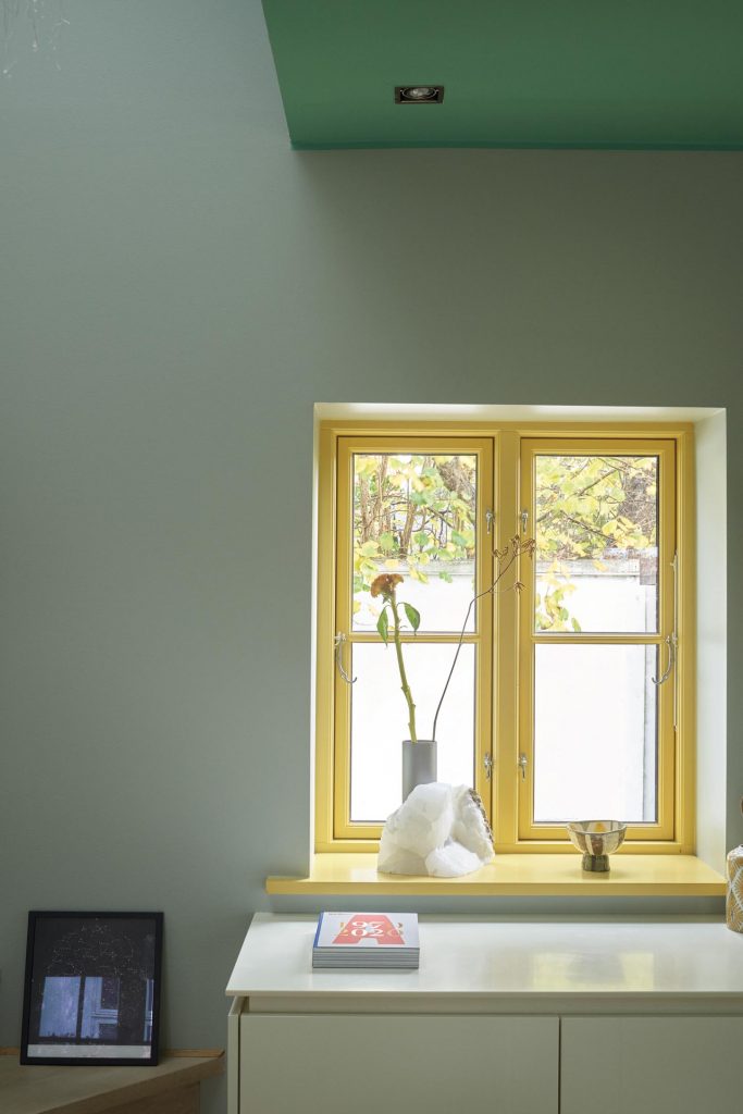
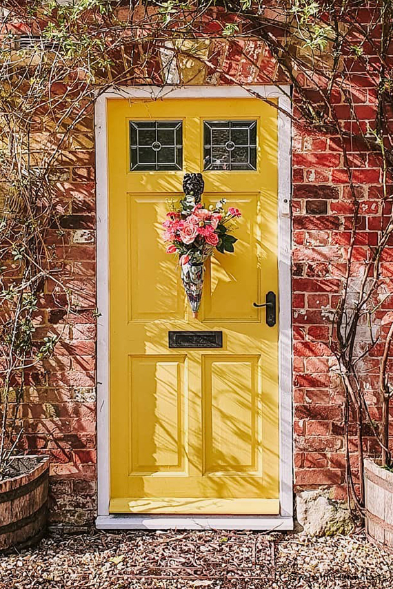
Babouche No.223
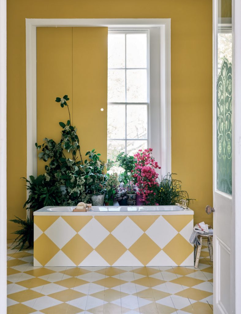
In 2022 we will relish brighter colors that herald a return to normality. The cheerful and uncomplicated Babouche is the perfect tone for this task. While bold, it never feels garish or overpowering.
(Photo: James Merrell)
Rooms that feature Babouche appear to be full of sunshine, especially when combined with understated School House White. The palette itself has a simple, folksy feel, but its use across the walls, bath panel and floor creates an overall look that is incredibly striking.
Babouche No. 223. (Photos: Farrow & Ball)
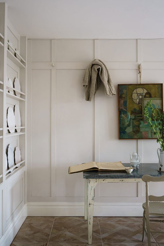
School House White No.291
There is something so familiar and comforting about a painted floor – this Checkerboard pattern in Stone Blue and School House White Modern Eggshell instantly transports you to the past.
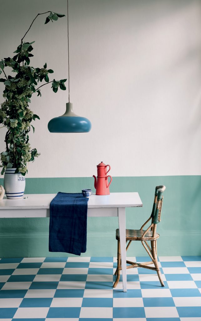
The nostalgic feel continues with Breakfast Room Green (in washable Modern Emulsion) on the lower walls and School House White (in the flatter Estate Emulsion) on the upper walls and ceiling.
School House White No.291. (Photos: Farrow & Ball)
This age-old form of decorating introduces color just below eye level to retain a light and airy atmosphere above, while also providing durability.
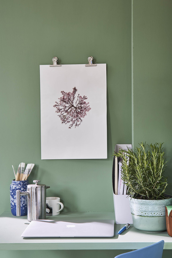
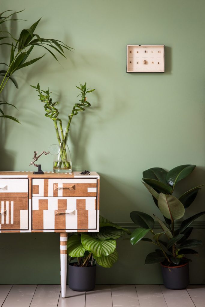
Breakfast Room Green No.81
Using one color on both walls and woodwork, such as lively Breakfast Room Green, can make a room look bigger by disguising the limits of the space.
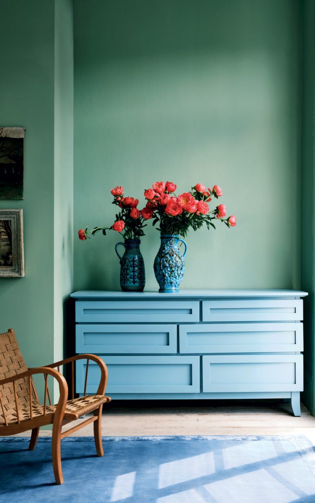
The bold use of this one color also creates an exceptional background for art, or for furniture which can be upcycled with a lick of Modern Eggshell.
Breakfast Room Green No.81. (Photos: Farrow & Ball)
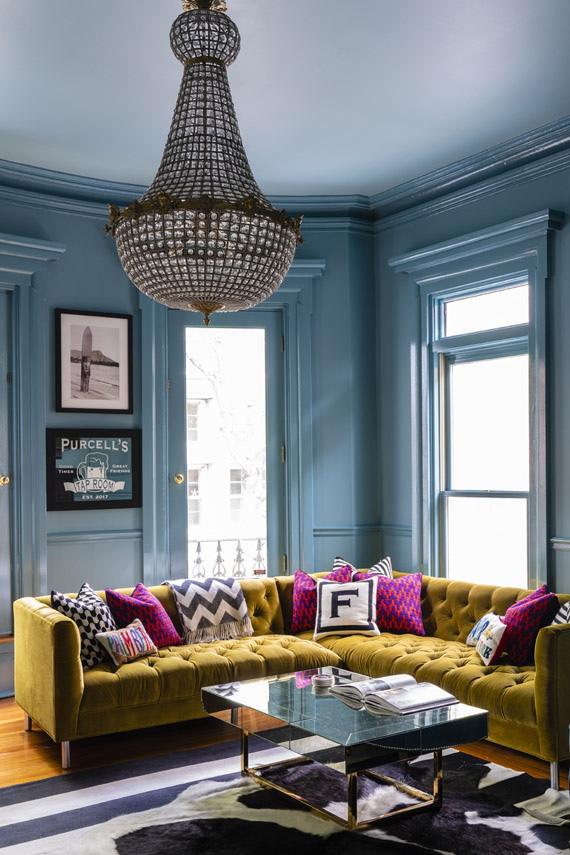
The combination here of Breakfast Room Green and Stone Blue feels both arresting and familiar, while the chalky matte finish of our signature Estate Emulsion on the walls shows these colors at their very best as the light changes through the day.
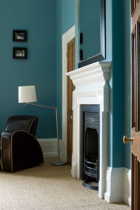
Stone Blue No.86
School House White is pared back, timeless and familiar but has a subtle sophistication that makes it the perfect foil for stronger hues like the lively tones of Stone Blue, used here on the door in Full Gloss.
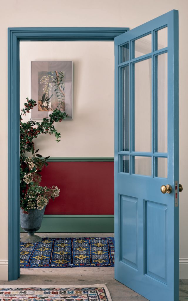
The traditional values of Full Gloss are perfect for use in the home in 2022 and can be introduced sparingly and in surprising ways (perhaps on a door or a kitchen unit) to add a modern feel with a suitably vintage flavour.
Stone Blue No.86. (Photos: Farrow & Ball)
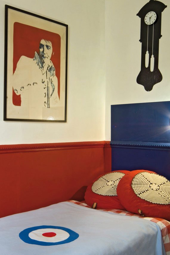
The strong classic tones of Incarnadine below the chair rail also introduce some excitement while retaining an element of modesty.
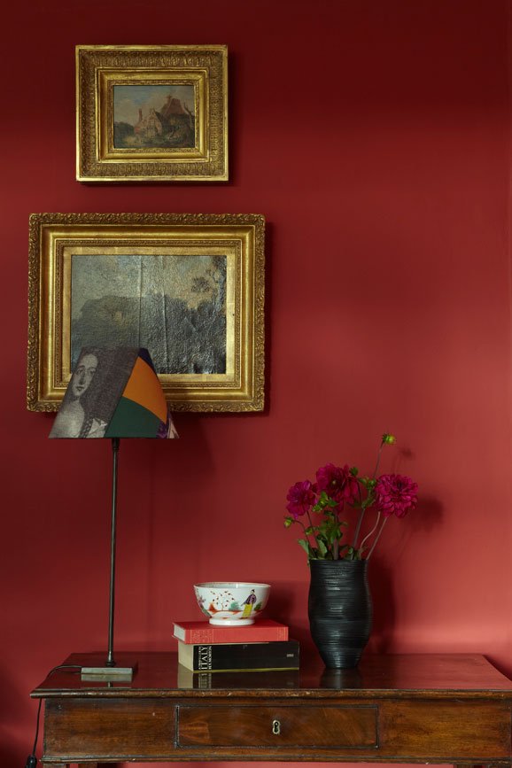
Incarnadine No.248
It is so heartening to see an eclectic mix of styles and colors, chosen not only for pure pleasure but as part of a great decorative hack – in this room, the overall effect is happy and bold.
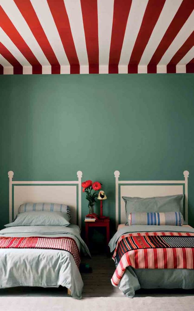
Headboard shapes are painted in School House White directly onto the Breakfast Room Green walls, while bold stripes have been introduced on the ceiling in rich, clean Incarnadine.
Incarnadine No.248. (Photos: Farrow & Ball)
Perhaps most cleverly, the ceiling stripes have been brought down onto the walls a short way, which creates an intimate tent-like feel and softens the join between wall and ceiling.
Farrow & Ball – farrow-ball.com
Based in Dorset, England, since 1946, Farrow & Ball is dedicated to creating eco-friendly paint and wallpaper using only the finest ingredients and richest pigments.
The result is a directional palette of paint colours with an extraordinary response to light and artisanal wallpapers with a tactile finish, uniquely achieved by printing paint on paper. Together, they transform homes of all kinds, inside and out, all over the world.
From the signature chalky matte of Estate Emulsion to the durability of washable Modern Emulsion, each high-performance finish is crafted with a blend of up to five pigments and an eco-friendly water base, creating an extraordinary depth of color, a beautiful finish, and a product that’s safer for your world and all who share it.
As of May 2021, world-leading coatings manufacturer Hempel has signed a purchase agreement for the acquisition of Farrow & Ball.
Joa Studholme
Color Curator Joa Studholme has worked with Farrow & Ball for over 20 years, developing the color range and consulting on design projects.
Much of Joa’s work involves helping people see how Farrow & Ball paints work together to create a truly decorated feel. Working with the paints and papers every day, Joa has a wealth of experience on both residential and commercial projects. She is also a prolific public speaker, spreading the word about how color can transform a room through her popular Color in the Home talks and books How to Decorate (paid link) and Recipes for Decorating (paid link).
Tags: 2022, Babouche No. 223, blue, blue green, blue grey, Breakfast Room Green No.81, Color, color codes, color hues, color trends, Farrow & Ball, green, home decor, Incarnadine No.248, interior, interior design, interior trends, mustard yellow, off white, paint, paint colors, pale colors, red, School House White No.291, Stone Blue No.86, Top, Trend Forecasting, trends, Yellow

 Share On Facebook
 Tweet It


