Forecast tones reflect a world that will be waking up and adjusting after a long period of restriction and uncertainty.
As consumers find their feet, these colors will connect to feelings of optimism, hope, stability and balance.
WGSN, the global authority on consumer and design trends, and Coloro, the authority on the future of color, announced that Digital Lavender will dominate in the key colors forecast to gain worldwide popularity in 2023.
Healing habits will become part of everyday life as consumers face new challenges, and recuperation rituals will place a new focus on colors that feel restorative and supportive of physical and mental health.
(Photo courtesy of WGSN & Coloro via YouTube)
Organic hues will tap into rising interest in nature and the countryside, with wholesome natural tones and low-impact and circular sources having a stronger appeal. On the flipside, saturated and stimulating colors will also return, driven by a longing for positivity and the growing influence of virtual worlds, where new forms of self-expression are flourishing.
Joanne Thomas, Head of Content for Coloro notes “As consumers find solace and comfort inhabiting the virtual space, the influence of video games and virtual realities will become all-encompassing, distorting the boundaries between our online and offline existence. Each of our emotive and sensorial key colors are ready to be embedded in both our physical and digital world, as we have balanced saturated, stimulating brights with organic, low-impact hues and mindful pales”
Our S/S 23 palette reflects a more hopeful and optimistic view of the future. We anticipate challenges ahead, however we believe consumers will seek out colors that they can engage with positively. This belief drove a shift towards more chromatic colors that feel activating and upbeat.
— Jenny Clark, Head of Color at WGSN
The partnership that delivers these predictions unites WGSN’s trend forecasting expertise with Coloro’s innovations in the future of color. It brings accurate and reliable color forecasting, with added intelligence from Coloro experts on achievability and sustainability with color. Each forecast tone is selected directly from the Coloro library of 3,500 contemporary hues, then rigorously tested by Coloro experts to ensure achievability across substrates and acceptable fastness. Anticipating achievability ensures wastage is minimised in the production process.
“The Coloro system’s broad range enabled us to select exactly the right color value to bring our seasonal concept to life. The format is instinctive and intuitive, allowing us to build a coherent range of colors which work perfectly together.” Jenny Clark added.
Joanne Thomas added that “Collaborating with WGSN allows Coloro access to industry experts from across the globe. Offering an unparalleled insight into future trends, consumer insights and product design direction, covering fashion, beauty and lifestyle, WGSN’s insights allow Coloro to be better equipped to serve our clients for the coming season.”
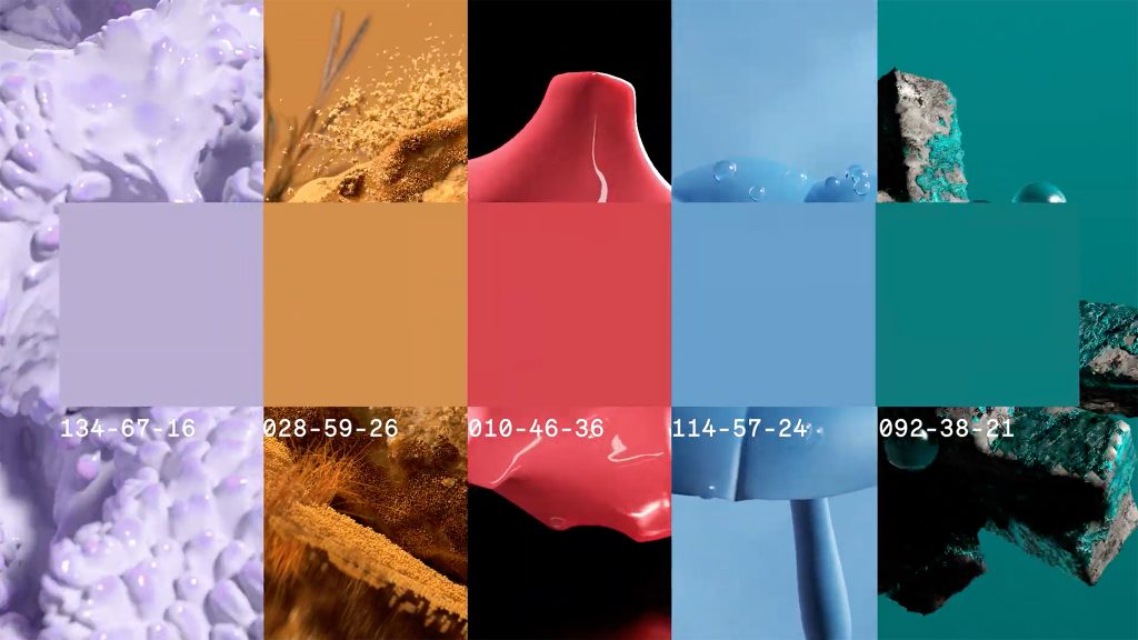
The key color palette for S/S 23, with the relevant Coloro code are as follows:
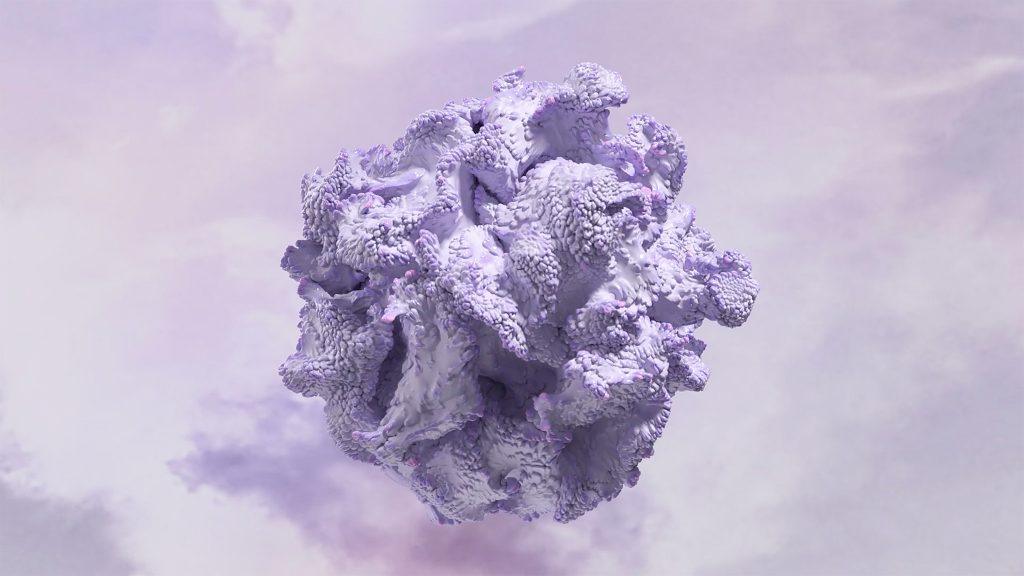
Digital Lavender | Coloro: 134-67-16 | Color of the Year 2023
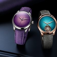
Purple will return as a key color for 2023, representing wellness and digital escapism. Recuperative rituals will become a top priority for consumers who want to protect and improve their mental health, and Digital Lavender will connect to this focus on wellbeing, offering a sense of stability and balance. Research suggests that colors with a shorter wavelength, such as Digital Lavender, evoke calmness and serenity. Already embedded in digital culture, we expect this imaginative color to converge across virtual and physical worlds.
(Photo courtesy of WGSN & Coloro via YouTube)
Digital Lavender is a gender-inclusive color that is already established in the youth market, and we expect it will broaden into all fashion product categories by 2023. Its sensorial quality makes it ideal for self-care rituals, healing practices and wellness products, and this purple will also be key for consumer electronics, digitised wellness, mood-boosting lighting and homewares.
Luscious Red | Coloro: 010-46-36
Luscious Red heralds the return of stimulating and digitised brights. Red is a powerful color that can raise the heart rate and tap into themes of desire, passion and empowerment, and this particular hue has a lightness and translucency that also feels immersive and hyper-real, making it perfect for both physical and digital products and experiences.
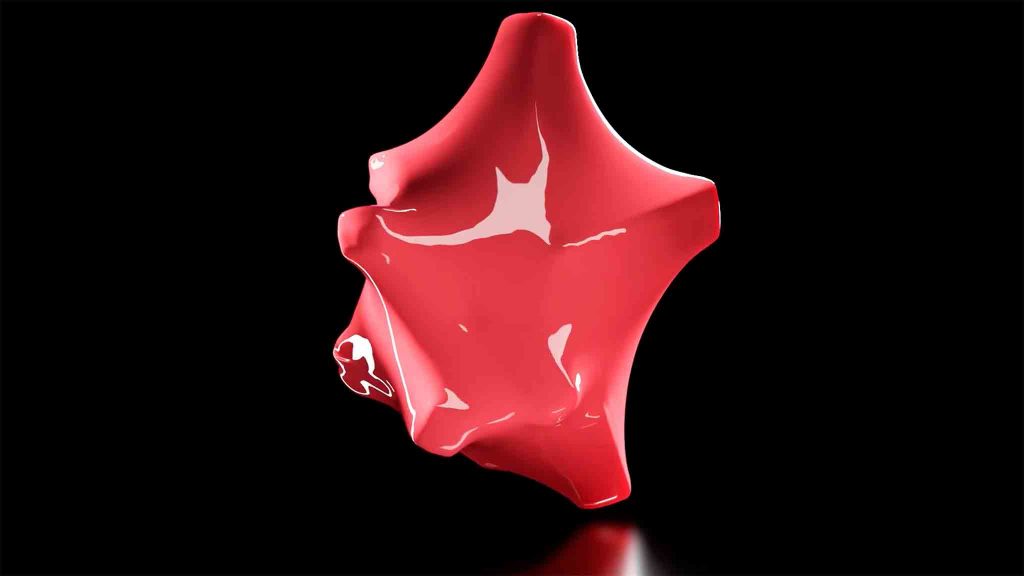
Luscious Red | Coloro: 010-46-36.
(Photo courtesy of WGSN & Coloro via YouTube)
Use Luscious Red’s emotive power to engage and connect with your customer, either as a carefully placed accent or as a singular hue for maximum impact. Embrace the boldness of this red and use it to heighten the senses.
Sundial | Coloro: 028-59-26
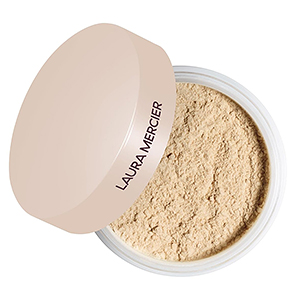
Organic, naturally derived colors will remain important as consumers reconnect with the countryside. With rising interest in craft, community, sustainability and more balanced lifestyles, earthy yellows such as Sundial will have a stronger resonance. This wholesome ochre yellow can also be naturally sourced from food waste, plants and minerals, connecting to the slow living movement.

Sundial | Coloro: 028-59-26.
(Photo courtesy of WGSN & Coloro via YouTube)
Sundial is a versatile yellow that can be used for multiple product categories. Its saturated yet earthy quality makes it suitable for a wide range of apparel and accessories that can be worn from day to night. Play with texture and shine to elevate or ground this tone, and use it as a singular tone or pair with neutrals or warm seasonal brights.
Tranquil Blue | Coloro: 114-57-24
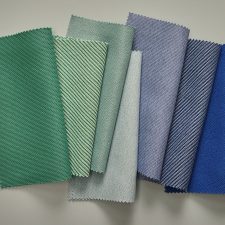
Blues – particularly bright mid-tones – will remain important for S/S 23. Tranquil Blue is a mid-level hue that connects to sustainable values, and it has a lightness and clarity that calls to mind the elements of air and water. It represents stillness and tranquility, which consumers will be seeking to counterbalance overwhelming emotions.
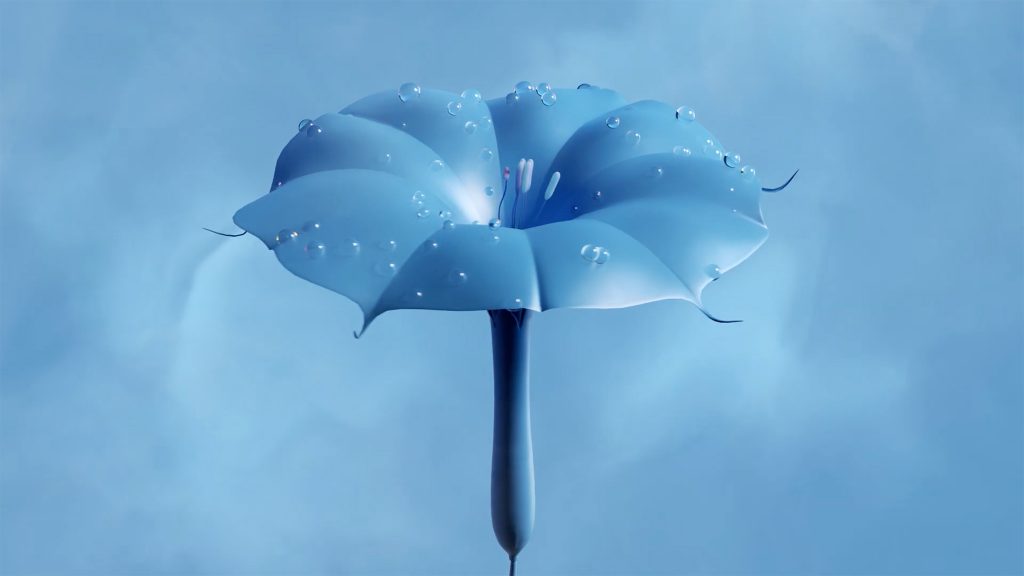
Tranquil Blue | Coloro: 114-57-24.
(Photo courtesy of WGSN & Coloro via YouTube)
Already emerging in the premium womenswear market, this color will resonate across all fashion categories as a contemporary update to midcentury blue. As a saturated mid-tone, it can be applied in large proportions to make a bold statement, but it can also become softer when paired with pastels or grounding neutrals.
Verdigris | Coloro: 092-38-21
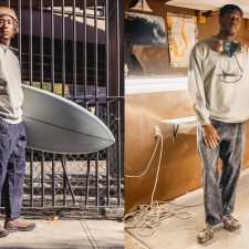
Verdigris is a saturated color that takes its name from the greenish pigment formed on oxidised copper. It sits between green and blue, and signals a shift towards invigorating digitised shades. This color is infused with nostalgia, harking back to 1980s sportswear and outdoor apparel. Going forward, we expect Verdigris to be reinterpreted as a progressive youth-led bright.
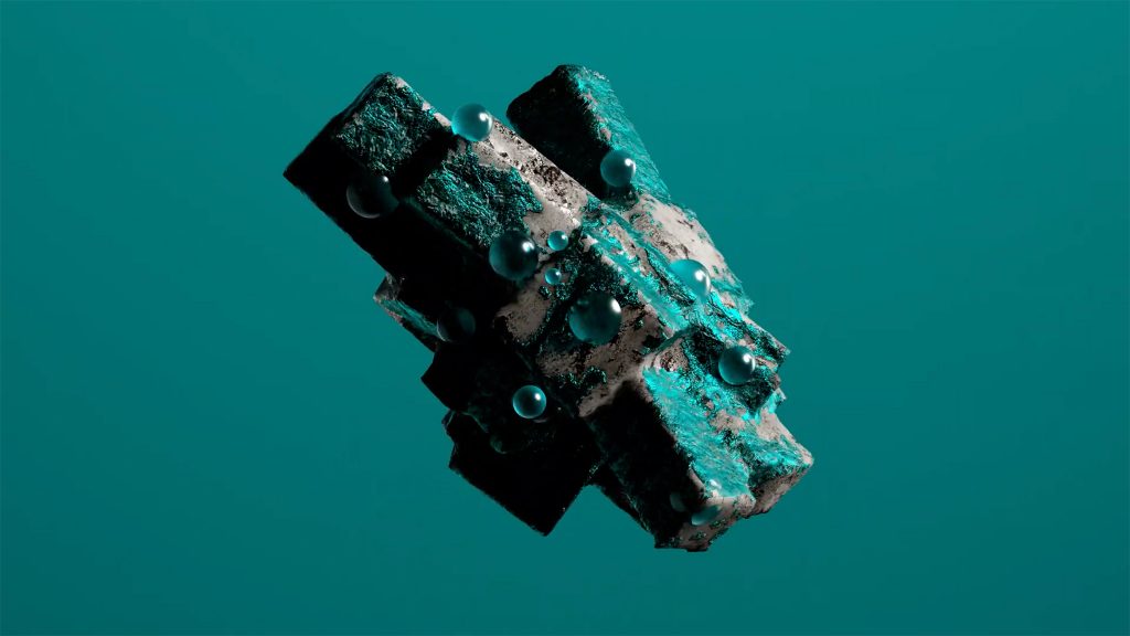
Verdigris | Coloro: 092-38-21.
(Photo courtesy of WGSN & Coloro via YouTube)
This color is already emerging in the casualwear and streetwear market, and we expect it to have a broader appeal by 2023. Use Verdigris as a transseasonal update for teal, relevant for all product categories. Its bold quality also makes it great for driving engagement on social channels.
WGSN – www.wgsn.com
WGSN is the global authority on consumer and design trends, helping brands across the globe create the right products at the right time for tomorrow’s consumer. Our trusted consumer and design forecasts power outstanding product design, enabling our customers to build a better future in the digital economy. We do this by constantly monitoring the signals of change that we know will impact how consumers think, feel and behave. Our experts then connect the dots to accurately predict the products, experiences and services people will need in years to come. We have been getting it right for over twenty years, helping the leading brands in 23 major consumer industries create resilient businesses.
Coloro – coloro.com
Coloro is a truly universal, intelligent and logical color system that allows fast and accurate communication throughout the color process and supply chain. A sister brand of WGSN, Coloro helps reduce waste and time in color decision-making and manufacturing by bringing creativity and science together. Coloro was created through collaboration with leading global textile and fashion companies. Coloro’s extensive library of 3,500 contemporary colors can be accessed through color books, and by purchasing swatches online. A free digital color tool, the Workspace, is also available on coloro.com
Ascential – www.ascential.com
Ascential delivers specialist information, analytics and ecommerce optimisation platforms to the world’s leading consumer brands and their ecosystems.
Our world-class businesses improve performance and solve problems for our customers by delivering immediately actionable information combined with visionary longer-term thinking across Digital Commerce, Product Design and Marketing. We also serve customers across Retail & Financial Services.
With more than 2,000 employees across five continents, we combine local expertise with a global footprint for clients in over 120 countries.
Ascential is listed on the London Stock Exchange.
All images and trend information are courtesy of WGSN & Coloro.
Tags: 2022, 2023, Ascential, blue, Color, color codes, color forecasting, Color of the Year, color palettes, color trends, Coloro, consumer trends, cool colors, COY 23, Digital Lavender, fashion trends, global trends, jade, key color palette, Luscious Red, Spring, Summer, Sundial, Top, Tranquil Blue, Trend Forecasting, trend reports, trends, trendsetters, Verdigris, WGSN
 Share On Facebook
 Tweet It

