Color in the New Era: Trends, Twists and Tweaks
Color and design trends for 2020 reveal a fascinating dichotomy as a new era brings in both novel and nostalgic approaches to color and design. A kaleidoscopic of colors twists into patterns or combinations that are authentic and real while other palettes appear somewhat surreal or out-of-the-ordinary.
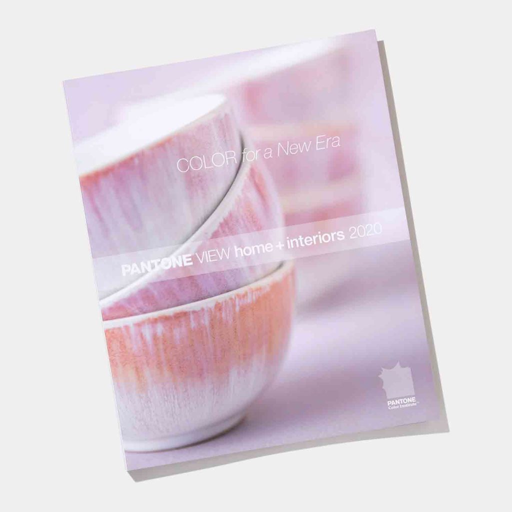
PANTONEVIEW home + interiors 2020 guides us into this new era reinforcing the notion that muted and vibrant tones can co-exist, and that a traditional style, especially when tweaked with futuristic touches, offers an unusual and original approach to a product or an interior.
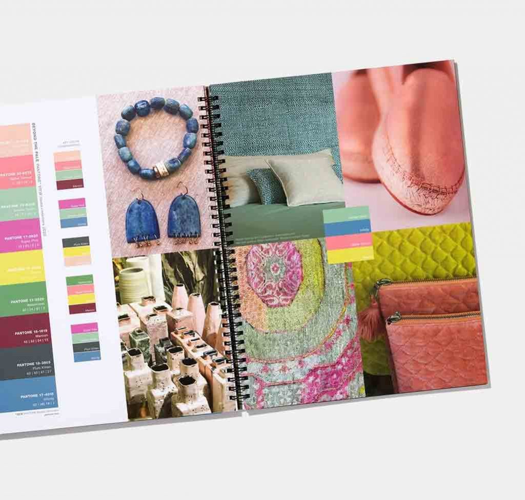
Format
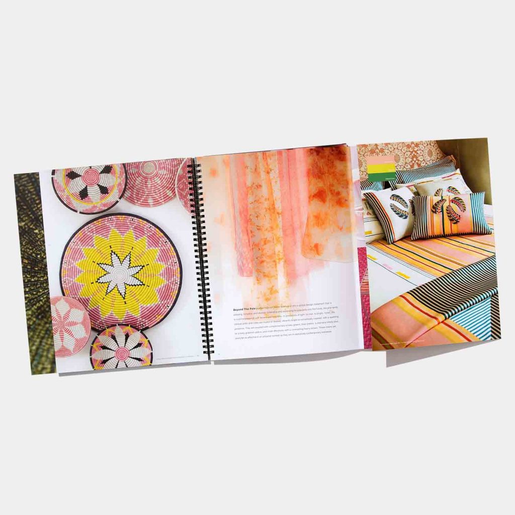
- Notebook style wire bound book containing 8 individual trend themes, each unfolding to 35″ x 12″ in size
- Portable color card highlighting color direction by color family and material direction housed in slipcover attached to inside back cover
- Forecast imagery separated by palette and color family available on enclosed USB drive
- Includes a PANTONE Color Manager Software download
Color
- Overarching forecast theme
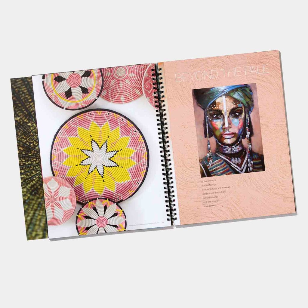
- 8 individual trend palettes supported by trend story, inspirational imagery, color harmonies and palette key words
- Each theme contains 6 trend pages displayed on 3-page fold out cards which unfold to 35″ width enabling more expansive viewing
- Topline look at key finishes, textures and pattern
- Written and visual overview highlights key color concepts
- Seasonal printed color card displays forecasted colors in chromatic arrangement and provides color overview by family
- CMYK values for each of the 72 forecasted colors
- PANTONE Color Manager Software
- Supporting visual imagery contained in each of the 8 key themes
Application
- Fold out trend card provide more expansive color viewing of each of the trend palettes
- Portable forecast color card provides versatility
- Each of the trend themes contain supporting color story, visual inspiration and key color guidance streamlining process for color planning
- Color palette harmonies showing color mixes and proportions facilitate product assortment planning
- Topline material, texture and pattern information highlights critical surface application and informs products for development
- Color direction by color family enables more informed color choices
- Chromatic presentation of forecasted colors showcases all forecasted colors for easy viewing
- Forecast displayed in PANTONE Colors facilitates color planning using the PANTONE Fashion, Home + Interior color language
- CMYK print values for each forecasted color enables color matching for print applications
- PANTONE Color Manger Software allows integration of all PANTONE Colors for digital design
- Supporting visual imagery makes it easy to create your own story board
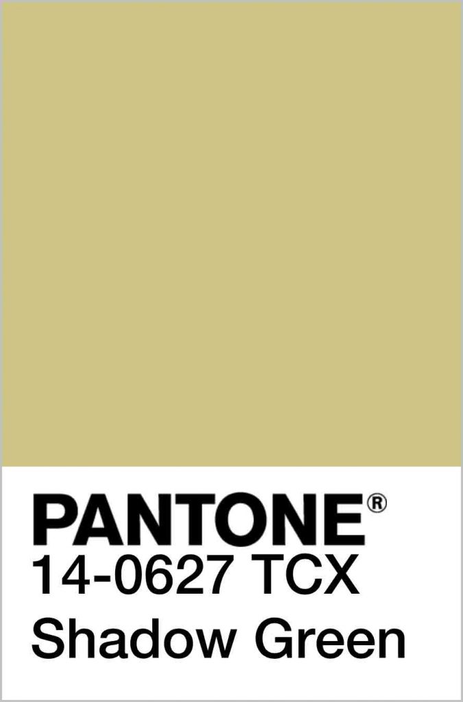
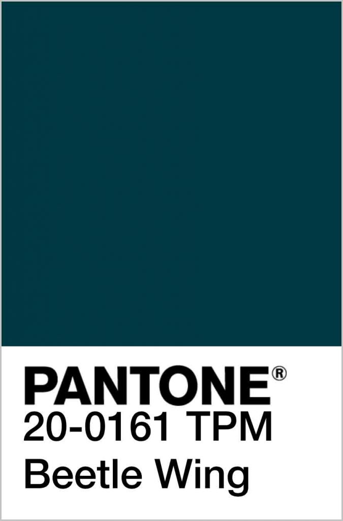
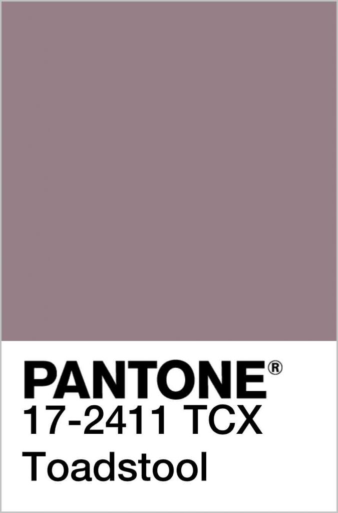
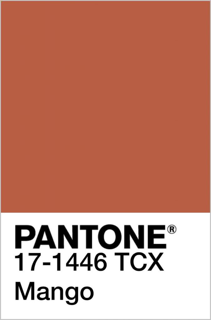
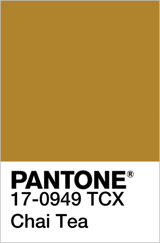
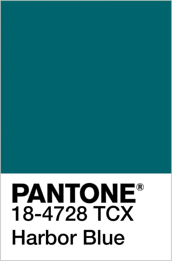
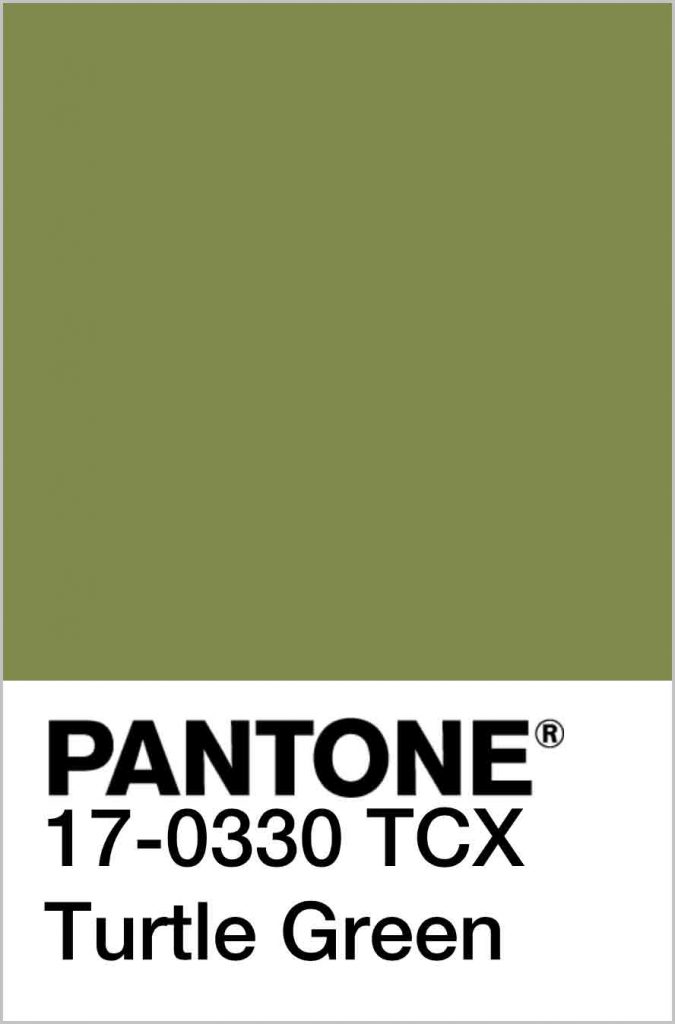
An emphasis on self-care combined with our affinity for nature based hues clearly comes through in Tea Garden, an artfully tranquil story of grounded tones, nature infused health-giving hues and contentment featured in PANTONEVIEW home + interiors 2020. Deliciously subtle, this memorable and sincere palette is both pure and poetic.
— Laurie Pressman, Vice President, Pantone Color Institute
Tea Garden Color Palette
Highlighted in PANTONEVIEW Home + Interiors 2020.
All images courtesy of Pantone.
Tags: Color, color codes, color palettes, color trends, home decor, interior, interior design, Laurie Pressman, Pantone, Pantone Color Institute, Pantone Matching System (PMS), PANTONEVIEW, Top, trend reports, trends
 Share On Facebook
 Tweet It


