ISPO TEXTRENDS’ vision for Fall/Winter 2019/20 color and textile trends has incorporated the need for change, but also a need for reassurance, creativity and new ideas
Color is crucial for the season, from the blazing seasonal bestsellers through to an enlivening new selection of tones from the unique satellite color palettes. There is a need for uplifting, enlightenment and a new positivity. The use of color isn’t just a case of injecting the bolder newcomers in full, it is about understanding the mood and creating new combinations that will deliver to all sectors.
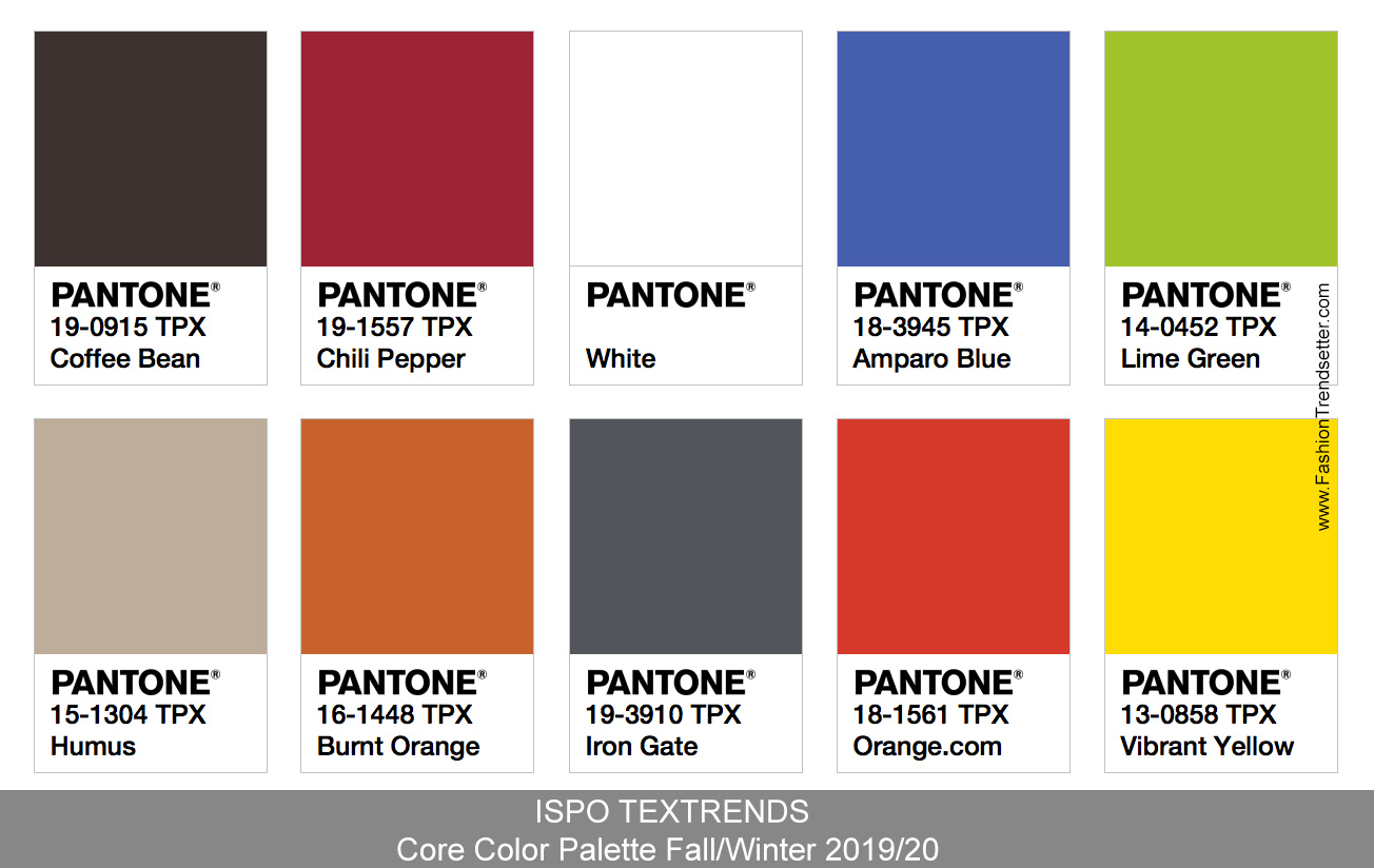
ISPO TEXTRENDS’ Core Color Palette
ISPO TEXTRENDS’ CORE color palette continues in strength, enhanced and reenergized through the inclusion of turning up the primary tones that feature in the bestselling sportswear tones, that many regard as the pinnacle of each year’s collection. This season also sees a bolder use of neutral hues offering a sharper delivery that compliments the satellite color palettes.
The color data provided is inspired by elements ranging from organic and natural through to new ideas as well as reworking past Eureka moments. Make the most of this season’s color palettes in engaging and energizing the final look.
ISPO TEXTRENDS’ Seasonal Satellite Color Palettes
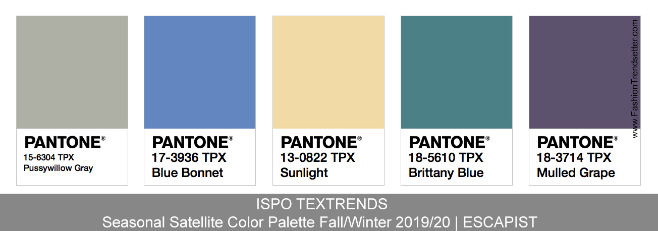
ESCAPIST
A dream of escape or the real deal in a daredevil action? This soft and striking palette can be worked whimsically in a matte direction or taken to a bolder and more intense look, especially for outer layers.
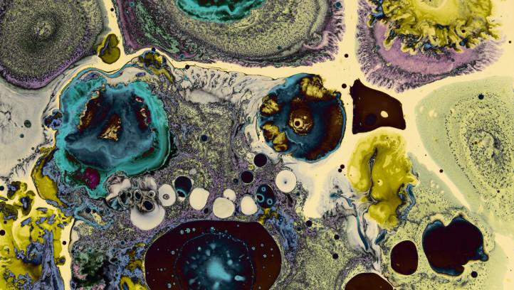
The key to this palette is freedom, it subtly moves and compliments, working seamlessly with color options from the Core palette.
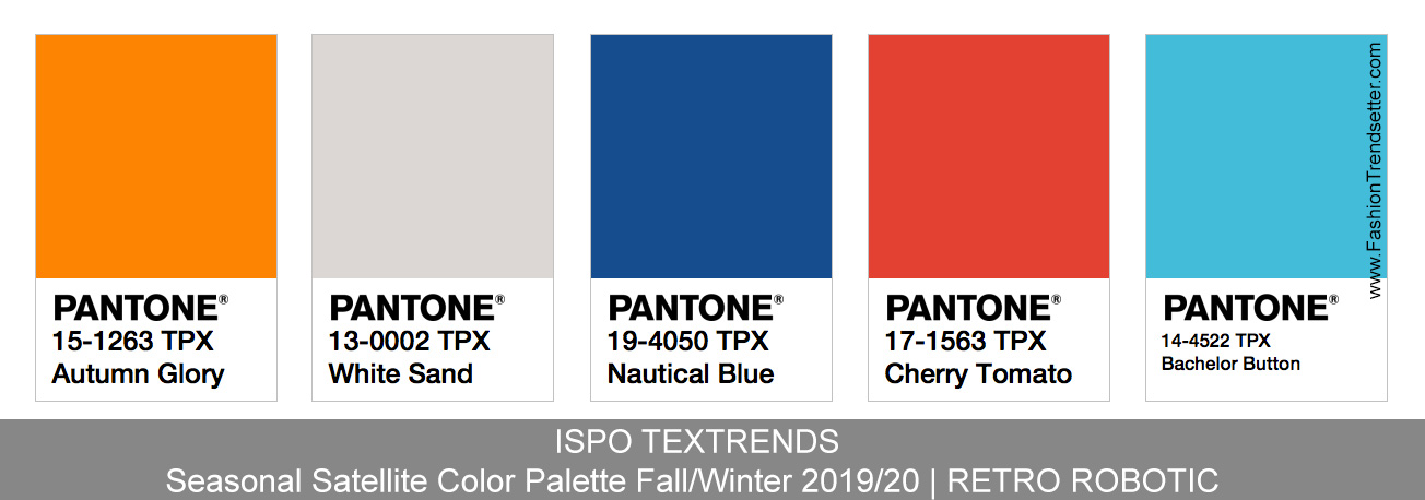
RETRO ROBOTIC
A vision of the future from the past inspires, as white makes a stronger statement pulled from the Core palette in engaging with retroesque tones that were once futuristic in the past.

Orange and light grey compliment, influenced by a sharper neon blue. This is a nod to those visionaries of the Seventies, who correctly predicted the technology that surrounds us.
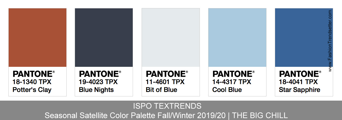
THE BIG CHILL
A warm and wintry palette that is truly dedicated to mother nature. From rich russet through to frosty dew tones and winter sky blue.
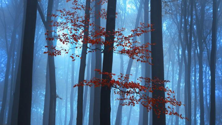
This color option is clean, crisp and concise on one hand, on the other it can be interpreted as a very snug choice depending on the final application.
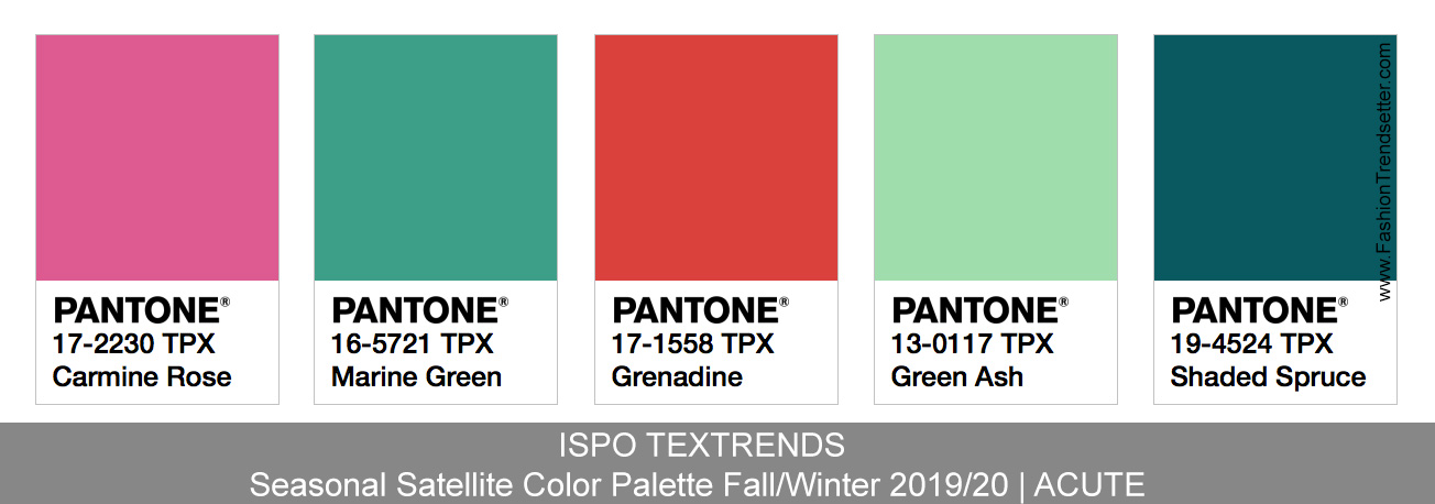
ACUTE
Artificial, electrifying and energetic in delivery, ACUTE offers a sharp uplifting effect, especially when worked with colors from the Core palette.
Striking whatever the amount used, from a hint of topstitching or from trims through to allover applications, ensuring there is a movement and transience about this palette with an inkling of the unexpected.
ISPO TEXTRENDS shows where the future in performance textile and components will lead us. A great inspiration for your business.
All trend information is courtesy of ISPO TEXTRENDS.
PANTONE color cards are arranged by Team Fashion Trendsetter.
For more information please visit:
ISPO MUNICH – textrends.ispo.com/en/
To get more information and learn more about the color codes of these palettes, please use The New Pantone Color Finder.
Tags: 2019, 2020, Autumn, Color, color codes, color palettes, color trends, Fall, fashion, fashion design, fashion events, fashion trends, ISPO, Mega Trends, Munich, Pantone, textiles, TEXTRENDS, Top, Winter

 Share On Facebook
 Tweet It


