A meeting of minds defines the Spring/Summer 2018 trend directions of ISPO as we look to re-engineering existing ingredients and implementing new discoveries.
There is an overall mood of euphoria, a frisson of excitement from fabrics, trims through to colors and the final exhilaration of the intended activities. From updated basics to invigorating next generation products, now is the time to push the boundaries, eliminate a solitary approach and explore and deliver the unique and new qualities that are set to be winners for the season.
The Spring/Summer season is all about exploring new directions that will enhance the consumers’ performance base and lifestyles, as we make the most of our leisure time as well as pursuing and attaining our goals. The message is clear, it is time to OWN IT! Take control of our lives, our health and our precious spare time in pursuing our sporting objectives. Live free, laugh and enjoy every day!
AXIS – Color Palette Spring/Summer 2018
The core palette for the season is a harmonious mix of reassuring brights and traditional neutrals in delivering a perfect pole position that will appeal across the board.
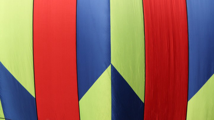 Black features as an accent, counterbalanced with intense summer sky blue and sunshine yellow. New takes on indigo blue also appeal and become an integral part of the season.
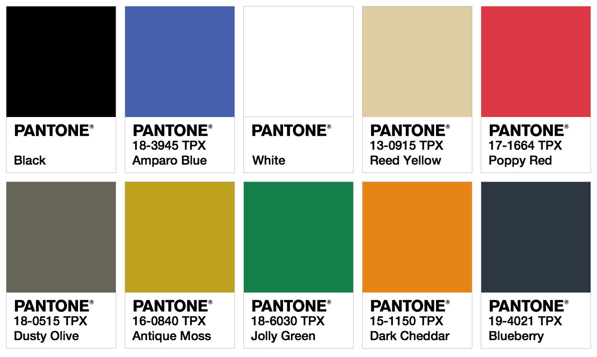
Satellite – Color Palettes Spring/Summer 2018
FESTIVAL
Inspired by the summer festivals, the initial bright hues turns take a misty twist in creating an innovative new direction for pastels in powdery form.
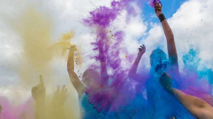 This palette is perfect for achieving the look through dye techniques, but also can be achieved through the combination of black yarns blended with brighter tones to get a grungy look.

DESERT DREAM
A natural based palette that gives depth to the colors of earth. From cactus green to sunset orange, there is a true relaxed mood to this palette and a strong unisex appeal.
 Work the tones from matte surfaces to semi-bright in delivering an innate sense of the great outdoors.

SCHOCKTACTIC
An energetic color direction that can be worked from intense matte bases through to illuminate shine in a bold approach. 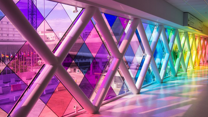 Appealing to both the natural and the synthetic sectors, this palette is meant to be seen and approached in a brazen way. Work it in solids or make it ashy as colors collide in fabric construction through to prints.

MIAMI VICE
An Art Deco approach uplifts tones from super soft hues to soothing colorations in both matte and metallic applications.
 Nebulous and mysterious tones are highlighted by sun kissed vintage accents that can lead to a more dominant delivery from transparent coatings.

ISPO TEXTRENDS shows where the future in performance textile and components will lead us. A great inspiration for your business.
All trend information is courtesy of ISPO TEXTRENDS.
PANTONE color cards are arranged by Team Fashion Trendsetter.
For more information please visit:
ISPO MUNICH – ispo.com
To get more information and learn more about the color codes of these palettes, please use The New Pantone Color Finder.
Tags: 2018, Color, color codes, color palettes, color trends, fashion, fashion design, fashion events, fashion trends, ISPO, Munich, Pantone, Spring, Summer, textiles, TEXTRENDS, Top
 Share On Facebook
 Tweet It


