INSPIRING AND EXPRESSING COLOR:
Defining the Essential Trends
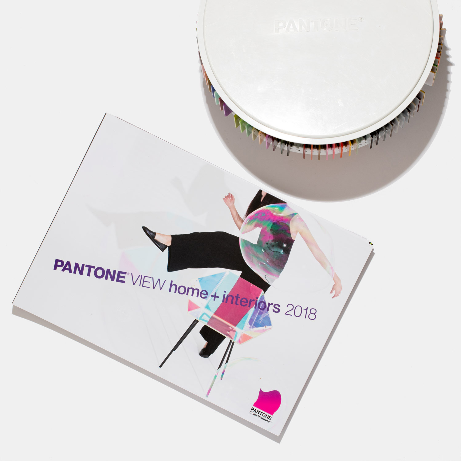
In our world of over communication, excessive information and endless connectivity, we have become option saturated. Distilling the complex universe of color concepts into eight distinctively designed palettes, PANTONEVIEW home + interiors 2018 will help you stay well ahead.
With Pantone’s desire to inspire and ensure you are on the right color path, Pantone’s key color stories for 2018 break free from traditional thinking: colors are revitalized, hues are mixed in novel combinations, and new color directions express a fresh approach that satisfies the consumers’ need for newness.
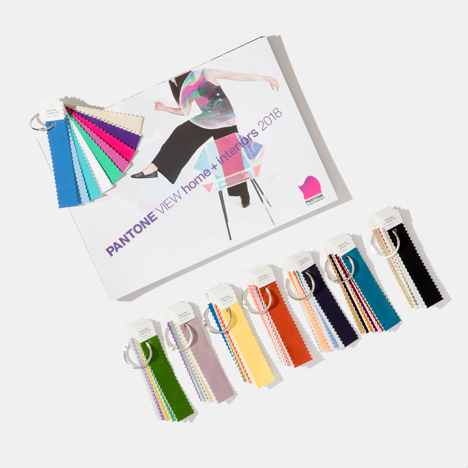
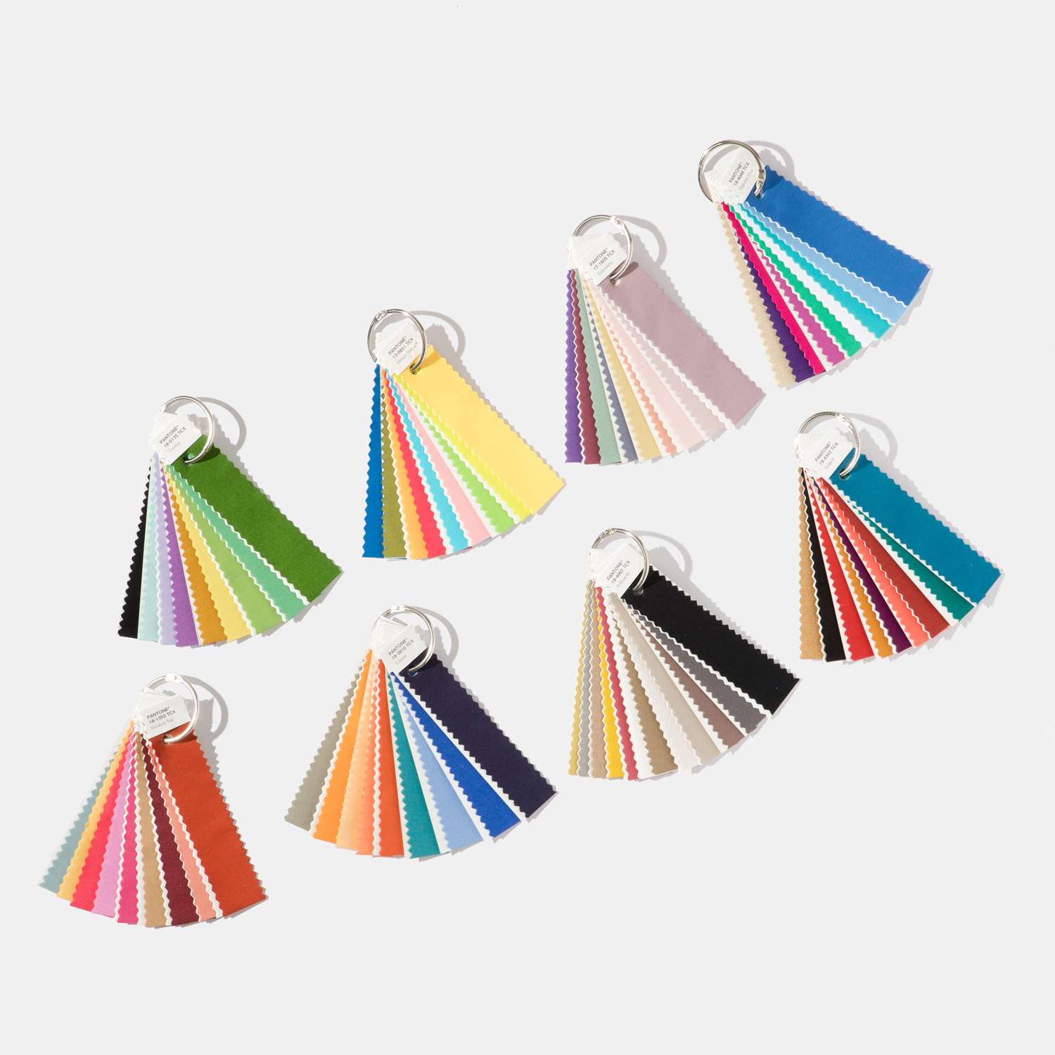
This book is paired with 75 forecasted Pantone cotton standards for soft home applications.
PANTONEVIEW home + interiors 2018 offers inspiration, key color direction and suggested color harmonies targeted towards interior design and home furnishings, including housewares, decorative accessories, bedding, bath, toys, ooring, indoor and outdoor furniture, paint, oral and food design.
Looking at color as the catalyst that can de ne the space and create the magic and the mood, PANTONEVIEW home + interiors is segmented by color trend with each story broken out in the following way:
1) Introduction
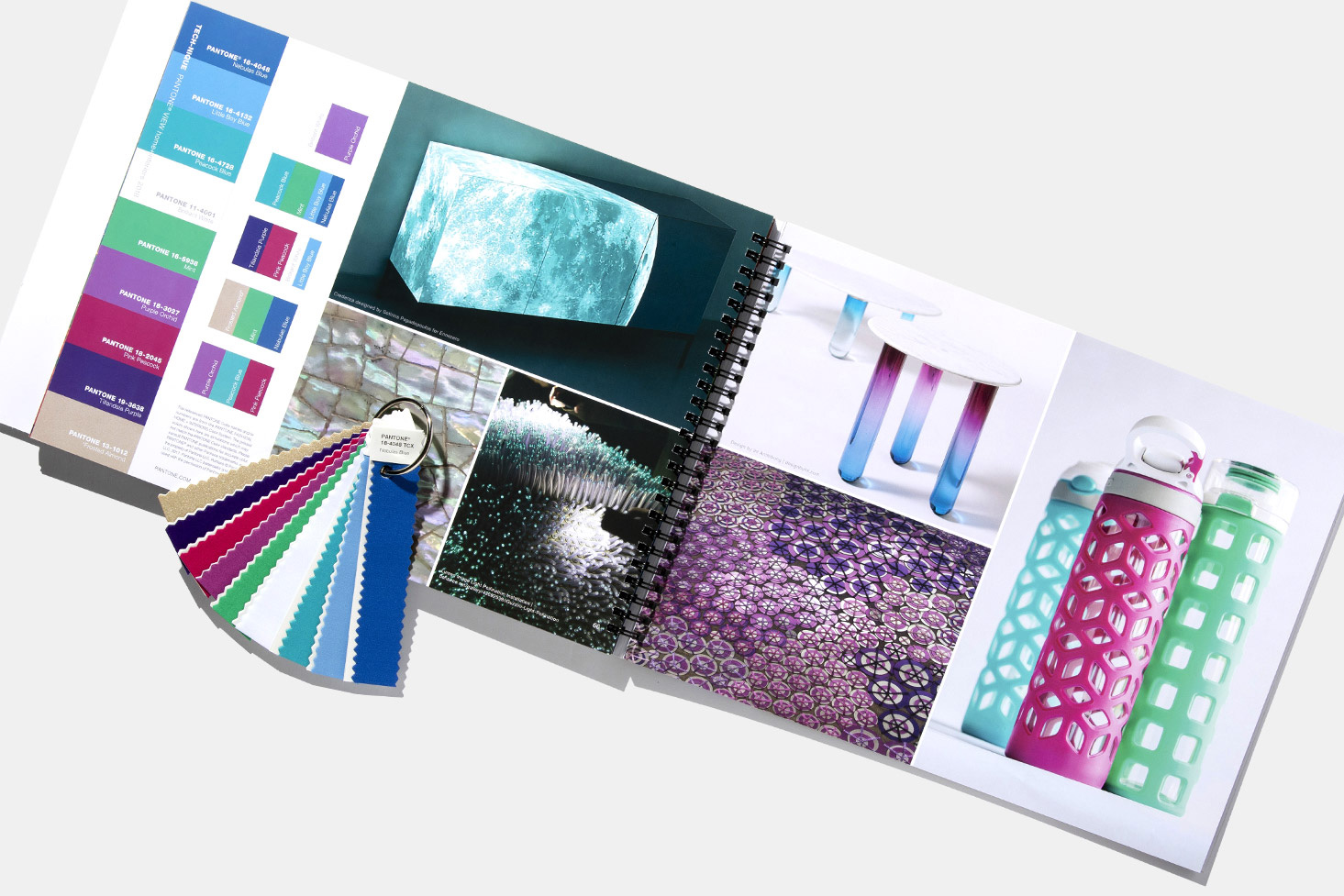
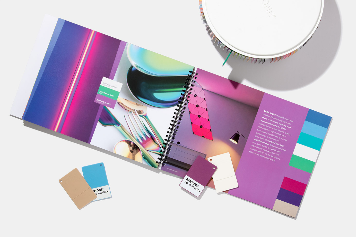
Each palette is introduced with a written overview of the trend and a supporting visual that sets the tone and highlights some of the key colors in the trend palette.
2) Inspiration Photos
Then follows four pages of photos which visually display the lifestyle concept or inspiration from which the trend story evolved and developed, as well as visuals of products and end-uses where the trend colors are applied. Color harmonies are displayed within these photos as are key palette descriptors.
3) Harmonies
Located within the photo pages is a printed color card of the trend palette along with the individual palette rationale, key color directives and color harmonies. Color harmonies show which colors should be mixed together and in what proportion or measure.
4) Summary Page
Highlighting additional insight and directions, a summary page concludes the forecast with a comprehensive color overview and a look at other factors in uencing the forecast.
5) 2018 Colors by Color Family
Printed color card displayed by color family provides a quick color overview.
6) 2018 Key Color Direction – NEW FEATURE
Written and visual overview highlighting key colors and concepts to take forward for product, interior design and visual merchandising.
Format
- 12” x 18” oblong format; soft-cover, wire-bound book
- 75 Forecasted Pantone cotton standards separated into palettes
- Printed color card highlighting color direction by color family
- Forecast imagery, separated by palette and color family, available via download
- Includes PANTONE Color Manager Software
Color
- Overarching forecast theme
- Eight individual palettes supported by trend story, inspirational imagery, color harmonies and palette key words
- Each trend palette contains four to five color harmony options
- Topline look at key finishes, textures, and patterns
- Printed color card displays forecast colors by family
- Written and visual overview highlights key color concepts
- CMYK values for each of the 75 forecasted colors
For those designing in plastic:
PANTONEVIEW home + interiors 2018/ Plastic Standards additionally includes large PANTONE Plastic Standards Chips of each of the 75 forecasted colors in a carousel organiser.
This PANTONEVIEW home + Interiors format comes with 75 forecasted plastic standards in a spinning carousel arranged by palette.
Pantone
www.pantone.com
Pantone provides a universal language of colour that enables colour-critical decisions through every stage of the workflow for brands and manufacturers. More than 10 million designers and producers around the world rely on Pantone products and services to help define, communicate and control colour from inspiration to realisation – leveraging advanced X-Rite technology to achieve colour consistency across various materials and finishes for graphics, fashion and product design. Pantone Standards feature digital and physical colour specification and workflow tools. The Pantone Color Institute™ provides customized colour standards, brand identity and product colour consulting as well as trend forecasting inclusive of Pantone Color of the Year, Fashion Runway Color Trend Reports, colour psychology and more. Pantone B2B Licensing incorporates the Pantone Colour System into different products and services, enabling licensees to communicate and reproduce approved Pantone values and improve efficiencies for their users. Pantone Lifestyle brings colour and design together across apparel, home, and accessories.
PANTONE® and other Pantone trademarks are the property of Pantone LLC. PANTONE Colors may not match PANTONE-identified standards. Consult current PANTONE Color Publications for accurate color. All trend information © Pantone – http://www.pantone.com
Tags: 2018, Color, color codes, color trends, design, fashion and lifestyle, home, home decor, interior, interior design, Mega Trends, Pantone, PANTONEVIEW, Top
 Share On Facebook
 Tweet It


