FALL 2016: A Unity of Strength, Confidence and Complexity
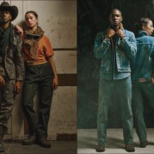
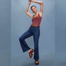
The desire for tranquility, strength, and optimism have inspired a Fall 2016 color palette that is led by the Blue family.
Along with anchoring earth tones, exuberant pops of vibrant colors also appear throughout the collections. Transcending gender, these unexpectedly vivacious colors in our Fall 2016 palette act as playful but structured departures from your more typical fall shades.
Blue skies represent constancy as they are always above us. Grays give a feeling of stability, Red tones invite confidence and warmth, while the hot Pinkish Purples and Spicy Mustard Yellows suggest a touch of the exotic.
– Leatrice Wiseman, Executive Director of the Pantone Color Institute™
Top Ten Colors for Fall 2016:

The report is available at pantone.com/fashion-color-report-fall-2016
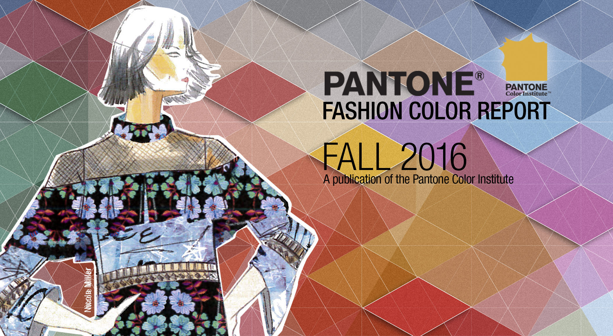
Pantone Fashion Color Report Fall 2016
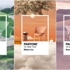
Mood Boards by Pantone Color Institute & Fashion Snoops
NEW! RIVERSIDE | PANTONE 17-4028
Earmarking the importance of Blue in the palette, the new blue shade of PANTONE 17-4028 Riverside undeniably takes precedence in the fall collections.
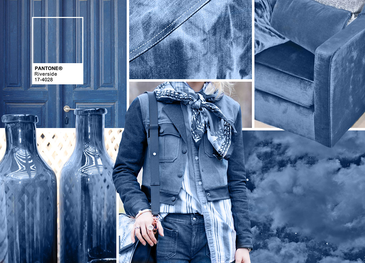 Door: Santorini by Mddphoto Denim: Gucci Chair: Domedeco By Eurofashion Ambiente Clouds: Night Clouds by John North Woman: Fashion Snoops Street Style Vases: Eightmood Ambiente, Moodboard Courtesy of Pantone – pantone.com
-Cool and calming, strong and stable
-Displays a subtle vibrancy and sophistication
-Borders on exciting, yet
-Maintains a sense of constancy
Leatrice Eiseman, Executive Director, Pantone Color Institute™
NEW! AIRY BLUE | PANTONE 14-4122
Pantone 14-4122 Airy Blue’s lofty nature evokes feelings of lightness and freedom.
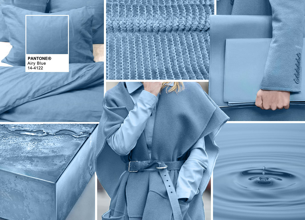 Bedding: Himla Ribbed Fabric: Duca Visconti Purse: Extracted with permission from PANTONEVIEW Colour Planner – Disguise Water Droplet: Ripples on Water by Deniz Bayram Woman: Fashion Snoops Street Style Texture Block: Extracted with permission from PANTONEVIEW Colour Planner – Disguise, Moodboard Courtesy of Pantone – pantone.com
-Designers seeking weightlessness in a world heavy with conflict
-Blue tones appear in nearly half of the designs
-Airy Blue nods to Serenity
-Pair Airy Blue with Lush Meadow, Taupe or Dusty Cedar for fresh approach
Leatrice Eiseman, Executive Director, Pantone Color Institute™
NEW! SHARKSKIN | PANTONE 17-3914
There’s an edge to PANTONE 17-3914 Sharkskin, and yet it manages to remain neutral.
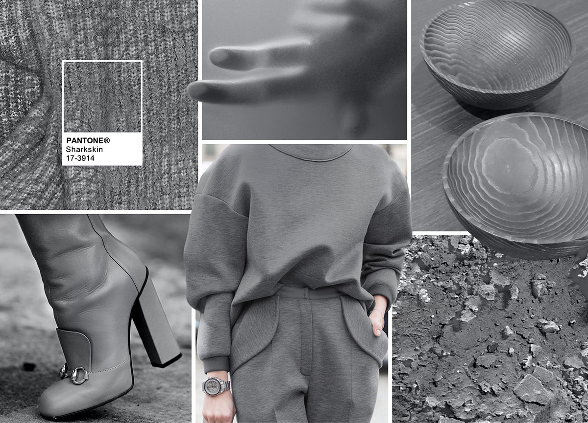 Chunky Knit: Lou Dalton Hand: Extracted with permission from PANTONEVIEW Colour Planner – Reveal Bowls: Interni Edition Rocks: Extracted with permission from PANTONEVIEW Colour Planner – Reveal Woman: Fashion Snoops Street Style Shoe: Fashion Snoops Street Style, Moodboard Courtesy of Pantone – pantone.com
-Pair-able with almost any fall color, bright or muted
-A color that the rest of the palette can literally and theoretically rest on
-Showcases practicality through a dependable but contemporary lens
Leatrice Eiseman, Executive Director, Pantone Color Institute™
AURORA RED | PANTONE 18-1550
In contrast to the stable backbone of the Fall 2016 palette, PANTONE 18-1550 Aurora Red adds a welcome punch.
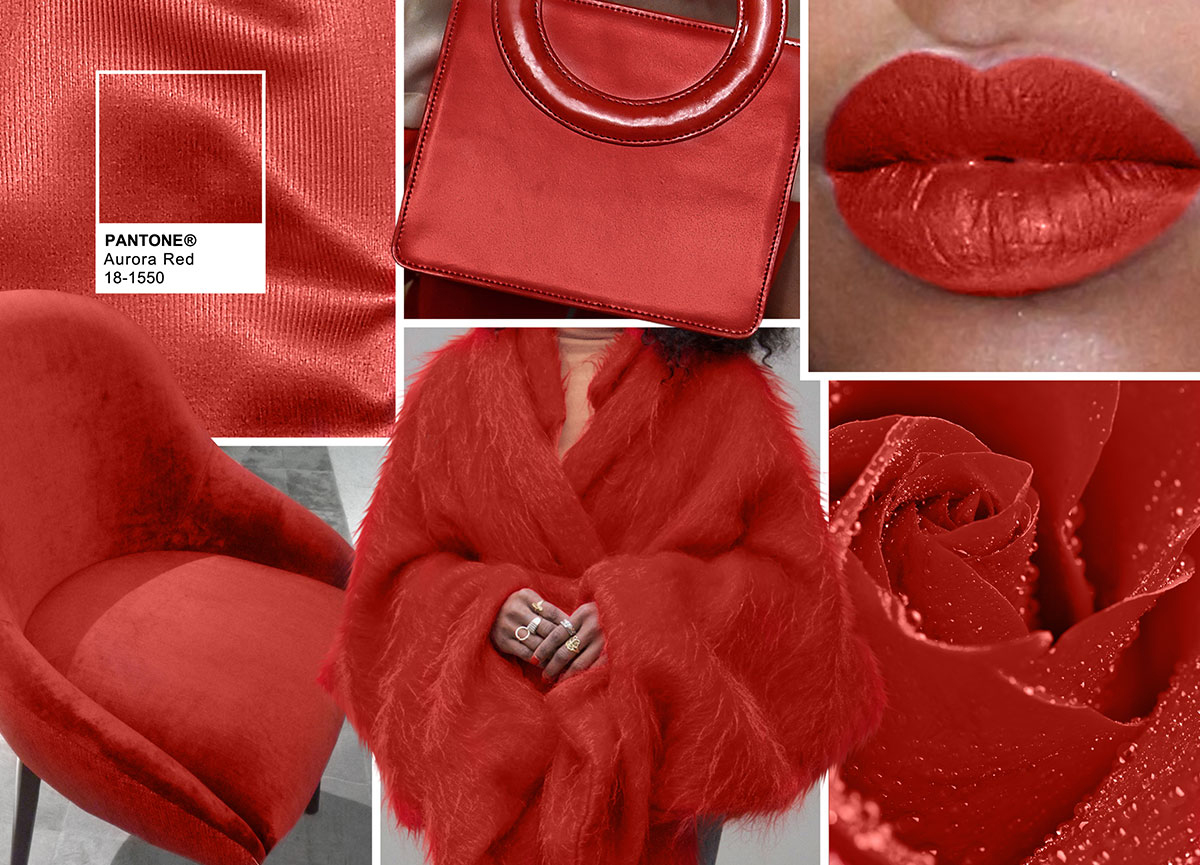 Silk: Barbara Casasola Bag: Opening Ceremony Lips: Fashion Snoops Beauty Rose: Rose in Waterdrops by Gn Om Woman: Fashion Snoops Street Style Chair: Mambo Unlimited, Moodboard Courtesy of Pantone – pantone.com
-A bold Red that is warm, sensual and immediately pleasing to the eye
-Gets the metaphorical blood of the palette pumping
-Exciting and dynamic, breeds unmistakable confidence
Leatrice Eiseman, Executive Director, Pantone Color Institute™
WARM TAUPE | PANTONE 16-1318
PANTONE 16-1318 Warm Taupe is a hearty, pleasing and approachable neutral that pairs well with each of the top 10 shades of the Fall 2016 season.
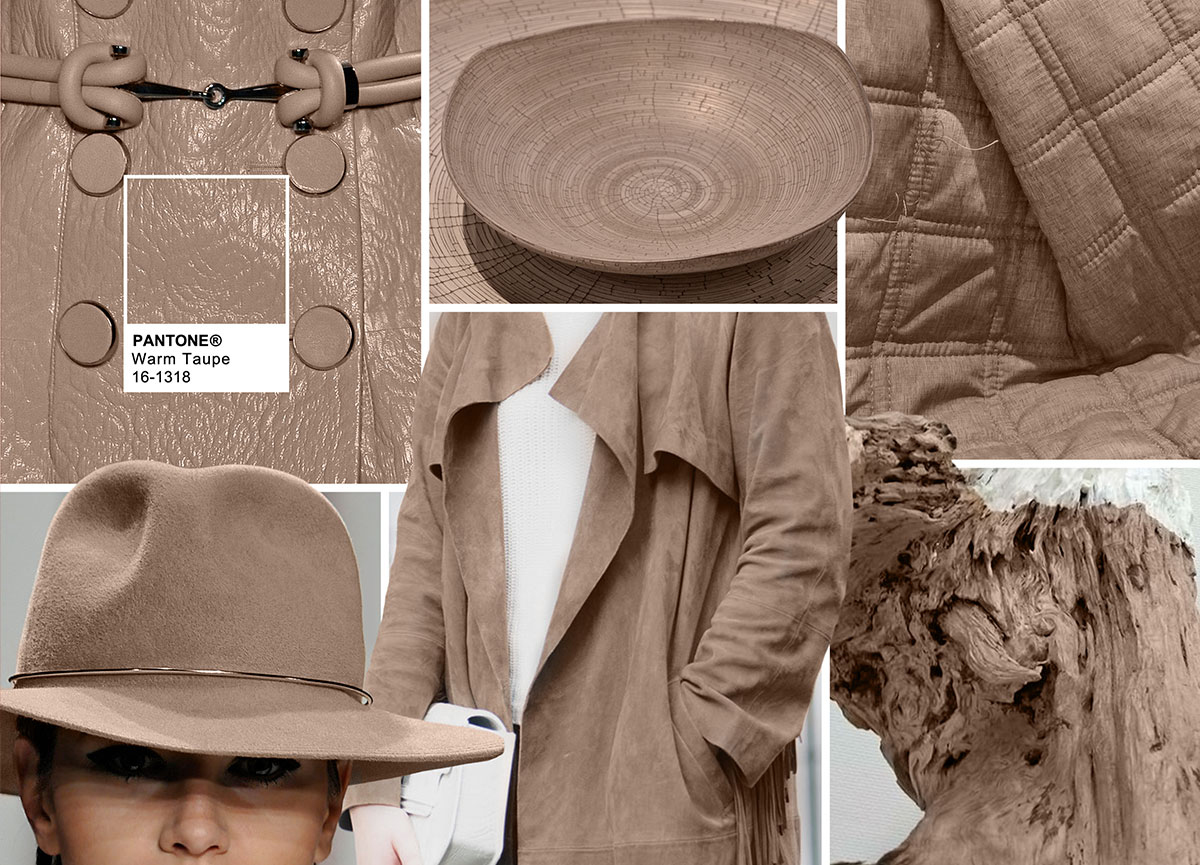 Jacket Front: Alexander McQueen Plate: Rina Menardi Quilted Fabric: Weft Wood: Extracted with permission from PANTONEVIEW Colour Planner – Reveal Woman: Fashion Snoops Street Style Hat: Zimmerman, Moodboard Courtesy of Pantone – pantone.com
-Suggests reassurance and stability
-Trusted, organic and grounded
-Departs slightly from the foundations of the Fall 2016 palette
-Timeless
Leatrice Eiseman, Executive Director, Pantone Color Institute™
DUSTY CEDAR | PANTONE 18-1630
Like Airy Blue, PANTONE 18-1630 Dusty Cedar gives a nod to the PANTONE Color of the Year 2016, Rose Quartz.
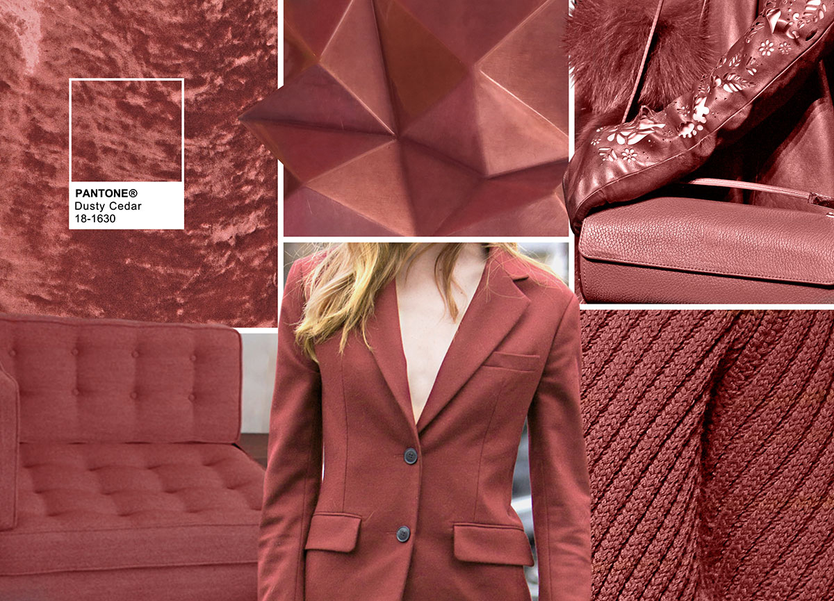 Velvet: Acne Studios Pyramid Surface: Covet Studio Bag + Glove: Aigner Woman: Fashion Snoops Street Style Chunky Knit: Canali Sofa Andreu World, Moodboard Courtesy of Pantone – pantone.com
-A fall and winter version of the Pinks we’re used to seeing in spring
-Dustier rose-toned Pink shade with some complexity
-Exudes warmth and welcome
Leatrice Eiseman, Executive Director, Pantone Color Institute™
NEW! LUSH MEADOW | PANTONE 18-5845
PANTONE 18-5845 Lush Meadow brings to mind fresh botanicals and foliage.
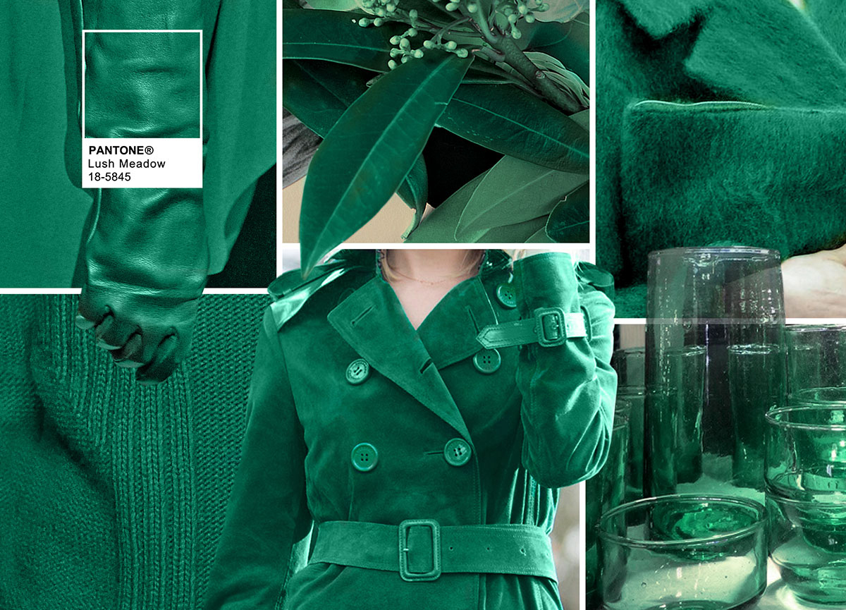 Glove: Elie Saab Leaves: Extracted with permission from PANTONEVIEW Colour Planner – Reveal Jacket & Purse: Extracted with permission from PANTONEVIEW Colour Planner – Reveal Glassware: Household Hardware Woman: Fashion Snoops Street Style Chunky Knit : Les Hommes, Moodboard Courtesy of Pantone – pantone.com
-Rich and elegant, vibrant and sophisticated
-This shade displays a brightness, panache and depth of color that elevates it from more natural greens
-Elevates the overall elegance woven through this season’s collections
Leatrice Eiseman, Executive Director, Pantone Color Institute™
NEW! SPICY MUSTARD | PANTONE 14-0952
Bounces elegantly off other colors in the palette, PANTONE 14-0952 Spicy Mustard is an exotic addition.
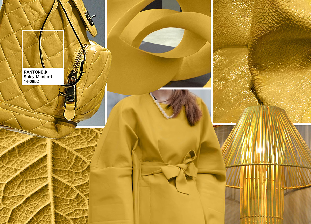 Mini Bookbag: Moschino Sculpture: Future History Leather: D & Co. Lamp: Devi Design Woman: Fashion Snoops Street Style Leaf Vains: SS17 – Progression – Inspiration, Moodboard Courtesy of Pantone – pantone.com
-Adds another splash of uplifting vibrancy
-A spicier, zestier Yellow than previous seasons
-Unexpected and unusual
-Comes through in both the abstract and geometric accents that designers employed
Leatrice Eiseman, Executive Director, Pantone Color Institute™
POTTER’S CLAY | PANTONE 18-1340
PANTONE 18-1340 Potter’s Clay has an added degree of sophistication and layering.
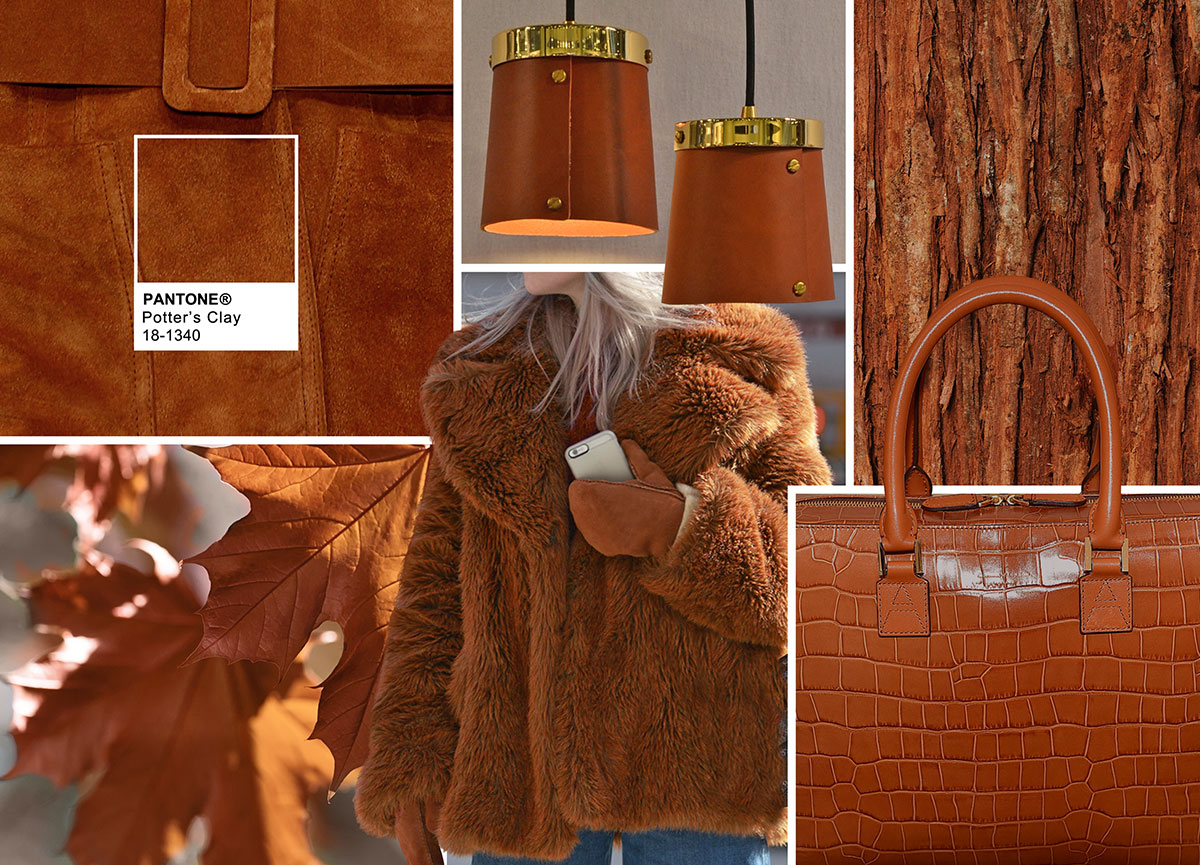 Suede: Daks Lamps: Simon Hasan Wood: Bark of Cedar Tree by kyoshino Bag: Aspinal London Woman: Fashion Snoops Street Style Leaves: Maple Leaves by Bes Junior, Moodboard Courtesy of Pantone – pantone.com
-Elements of russet Orange in its undertones, gives a grounded feeling that’s anything but flat
-Neutral earth tone; expected for fall and winter palette
-A shade with real substance; a strong foundation
Leatrice Eiseman, Executive Director, Pantone Color Institute™
NEW! BODACIOUS | PANTONE 17-3240
PANTONE 17-3240 Bodacious speaks to the gender fluidity we continue to see.
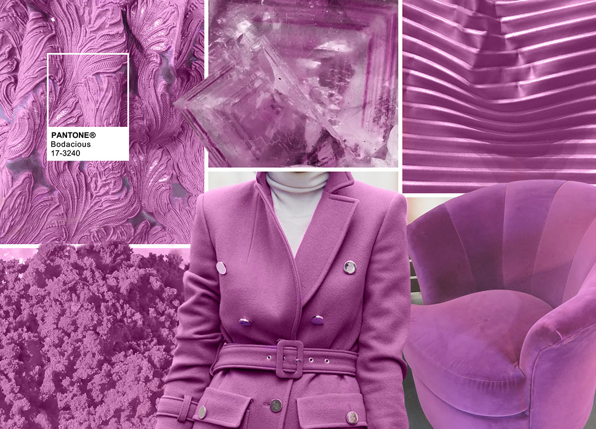 Jacquard Fabric: Europ Marchini Rock/Crystal: Extracted with permission from PANTONEVIEW Colour Planner – Reveal Leather: Leathertex Chair: Covet Studio Woman: Fashion Snoops Street Style Powder: SS17 – Changeling – Harmonies, Moodboard Courtesy of Pantone – pantone.com
-Lends itself to vibrant color combinations
-Unexpected in fall
-Versatile; can be used with Pinks and Reds
-Bright, rich Purple, with hints of a more sophisticated Pink
-Turns fashion accents into fashion statements
Leatrice Eiseman, Executive Director, Pantone Color Institute™
Pantone
Pantone LLC, a wholly owned subsidiary of X-Rite, Incorporated, has been the world’s color authority for almost 50 years, providing design professionals with products and services for the colorful exploration and expression of creativity. Always a source for color inspiration, Pantone also offers designer-inspired products and services for consumers.
The colors featured in the PANTONE Fashion Color Report are culled from the PANTONE FASHION + HOME Color System, the most widely used and recognized color standards system in the world. Each season, Pantone surveys the designers of New York Fashion Week and beyond to collect feedback on prominent collection colors, color inspiration and color philosophy. This information is used to create the PANTONE Fashion Color Report, which serves as a reference tool throughout the year for fashion enthusiasts, reporters and retailers.
More information is available at www.pantone.com
All trend information, color codes and moodboards are courtesy of Pantone – pantone.com
Tags: Color, color codes, color trends, ColorTrends2016, Fall, fashion, fashion design, fashion trends, Pantone, Pantone Fashion Color Report, Top

 Share On Facebook
 Tweet It


