Reveal: An Exploration of “Real” and “Unreal” Color
Multi-discipline forecast provides global color direction across womenswear, menswear, activewear, cosmetics, interiors, industry and graphic design.
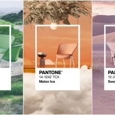
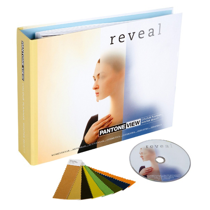
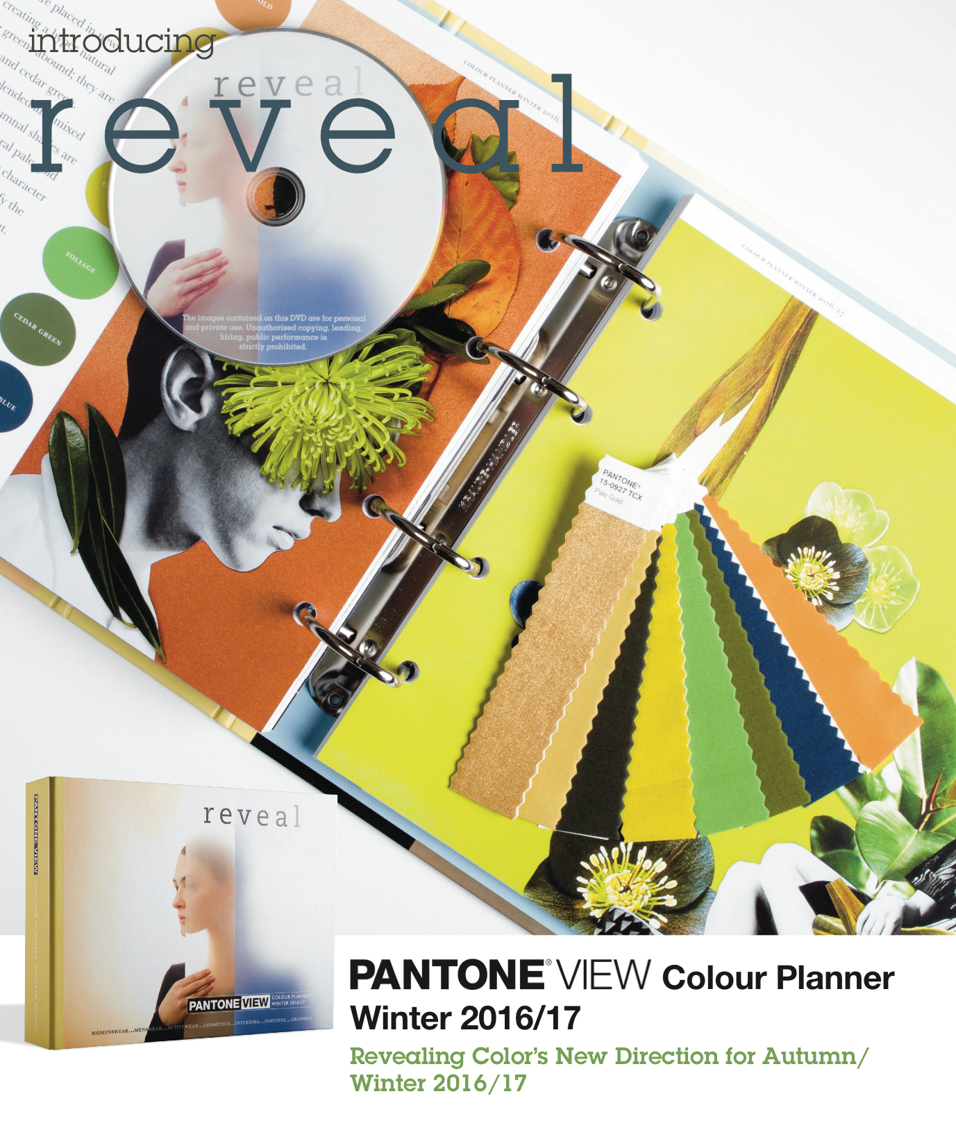
Pantone LLC, an X-Rite company and the global authority on color and provider of professional color standards for the design industries, introduced Reveal, the Autumn/Winter 2016/17 edition of PANTONEVIEW® Colour Planner. Looking at color as a total language, this multi-platform forecast offers seasonal inspiration, key color direction and suggested color harmonies for women’s and men’s fashion, activewear, cosmetics and lifestyle, as well as industrial and graphic design..
Just as the current direction in lifestyle fashion reflects a genuine polarization, color stories for 2016/17 display a contrast between color that is “real” and “unreal,” absent and present and a mixology of what is in between. We are divided between more modest and unpretentious shades and stronger, more saturated tones that make a bold statement. For those in the middle? A third platform of color that connects and bridges our desire to be sober or intoxicated, quiet or loud – or both at the same time.
“We find this idea of absence and presence, obscuring and revealing, very relevant not only when it comes to color, but also in the way we live our everyday lives,” said Laurie Pressman, vice president, Pantone Color Institute.
“On one hand, there is this wish to return to the simple, honest and unassuming, and on the flip side, a continuing presence of maximalist and a deep desire to stand out and be seen.”
PANTONEVIEW Colour Planner contains eight trend palettes as well as key seasonal color direction.
- Black—newly appreciated as a prestige color, black is the pulsating force behind the forecast and the perfect canvas on which other colors are revealed.
- White—appearing in cool and warm guises, white is important because of its properties as opposed to its actual color.
- Grays—essential to the palette, grays stretch across a variety of hues, warm and natural, muted and hard.
- Green—this season, greens take two directions: the first is a more yellowish and olive-oil-led direction while the second is cooler, sometimes glassy, but also more mineral, cool and Nordic.
- Yellow—reminding us of light and radiance, yellows are important this season because of their warming presence and their effects on surface and texture.
- Orange—now suffused with spicy hues, shades in the orange family display influences of caramel, cinnamon and saffron.
- Purple—penetrating all levels of design, purples, in a variety of berry colors are now a lifestyle as opposed to a fashion shade and is critical to this season’s palette.
- Blue—becoming more sophisticated, blues move away from the more classic indigo shades to those that are infused with gray or green.
- Brown—from nutmeg and tan to the red infused winey red browns, the browns continue to be very important across all materials and surfaces.
- Red—a safe option for those looking to add bright color, red is a well-received and well-understood pop color that is being combined in new ways.
- Pastels—pastel shades leap from nuanced neutrals to stronger and more assertive color.
- Metallics—metallics remain important; however this season they are as pragmatic as they are decorative, combining with light or texture to enhance, bring movement and textural dimension.
Published bi-annually, 18 to 24 months in advance of the season, the PANTONEVIEW Colour Planner is based on the PANTONE FASHION, HOME + Interiors Color System, the most widely used and recognized color standards system for fashion, textile, home and interior design. The book is produced by a team of leading visionaries from all over the world with expertise in different disciplines, providing comprehensive color-direction across multiple design areas.
Within each of the season’s directional color palettes, a general introduction outlines the colors included and the philosophy behind them. In addition, a specific breakdown of each palette highlights harmonies, suggested color combinations and suitable patterns, fabrics and products according to end use. For added convenience and usability, at the end of each palette section, there is a printed version of each PANTONE Fashion, Home + Interiors color featured in perforated swatch form and 1” x 4” detachable cotton strips. The PANTONEVIEW Colour Planner Autumn/Winter 2016/17 also comes with a DVD containing static images of photos used to illustrate the seasonal themes, a movie version that has music to set the unique mood of each individual palette, a printed color card where the forecasted colors are arranged by color family as well as by trend palette and a poster-sized overview of the season.
For more information please view the PANTONEVIEW Colour Planner Autumn/Winter 2016/2017 Reveal Brochure
Pricing and Availability
The PANTONEVIEW Colour Planner Autumn/Winter 2016/17 is available immediately for $750 from Pantone at www.pantone.com or from PANTONE distributors nationwide. Visit www.pantone.com or call (888) PANTONE for a list of distributors. PANTONEVIEW Colour Planner is published bi-annually by Metropolitan Publishing BV.
About Pantone and the Pantone Color Institute
Pantone LLC, a wholly owned subsidiary of X-Rite, Incorporated, is the global color authority and provider of professional color standards for the design industries. Pantone products have encouraged colorful exploration and expressions of creativity from inspiration to implementation for more than 50 years. Through the Pantone Color Institute, Pantone continues to chart future color direction and study how color influences human thought processes, emotions and physical reactions. Pantone furthers its commitment to providing professionals with a greater understanding of color and to help them utilize color more effectively. Always a source for color inspiration, Pantone also offers designer-inspired products and services for consumers. More information is available at www.pantone.com. For the latest news, trends, information and conversations, connect with Pantone on Facebook, Twitter, Pinterest, Instagram and the Pantone Blog.
About X-Rite
X-Rite, Incorporated, is the global leader in color science and technology. The company, which now includes color industry leader Pantone, develops, manufactures, markets and supports innovative color solutions through measurement systems, software, color standards and services. X-Rite’s expertise in inspiring, selecting, measuring, formulating, communicating and matching color helps users get color right the first time and every time, which translates to better quality and reduced costs. X-Rite serves a range of industries, including printing, packaging, photography, graphic design, video, automotive, paints, plastics, textiles, dental and medical. For further information, please visit www.xrite.com.
Tags: 2016, 2017, Autumn, books, Color, color codes, color trends, Fall, fashion design, interior, Mega Trends, Pantone, trends, Winter
 Share On Facebook
 Tweet It


