 |

Pantone Fashion Color Report for Spring 2012
Pantone Fashion Color Report for Spring 2012 |
Be one of the first to discover next season's hottest hues and designer inspirations in Pantone's Fashion Color Report Spring 2012. |
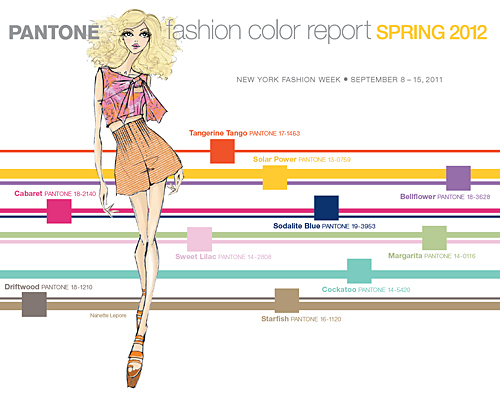 |
WOMENSWEAR COLORS
Provocative Tangerine Tango, an enticing juicy orange, is a vivacious and appealing refresher to enliven anyone's outlook this spring.
Providing a jolt of energy, Solar Power radiates warmth and cheer.
Fanciful Bellflower, a distinct ornamental purple, exudes uniqueness and creativity.
Scintillating and sexy, Cabaret is a sensual and intense rosy-red - an excellent choice for summer clothing and cosmetics.
Sodalite Blue, a classic maritime hue, brings order and calmness to mind. Like an anchor to a ship, this dependable shade works with every color in the palette.
Cockatoo, a tactile blue-green, is sure to make your spirits soar. This unusual hue adds a whimsical touch to the palette and will make a statement this spring.
Margarita, a piquant yellow-green, lifts spirits with its refreshing and stimulating glow.
Reminiscent of a blossoming garden on an early spring morning, fragrant Sweet Lilac evokes the fresh scents of summer. This delicate pinkish lilac adds a touch of romance to any wardrobe.
Natural, versatile neutrals add practicality to this season's brights. Driftwood, an adaptable blend of beige and gray with a slightly weathered feel, and Starfish, a perfect warm summer neutral, complement all colors featured in this season's top 10.
For an ultra-bold look this spring, try mixingBellflower with Tangerine Tango and Cabaret.
Combine Margarita with Sweet Lilac and Cockatoo for a subtle alternative, or Margarita with Sweet Lilac and Driftwood for a more practical variation.
Solar Power is best juxtaposed with Sodalite Blue, and for a safer bet, add a natural neutral like Starfish to the mix. |
New York Fashion Week |
September 8 – 15, 2011
September 9, 2011, [New York] - For Spring 2012 designers are inspired by diverse influences, showcasing a range of styles and lifestyles - from free and playful to light and breezy, and contemporary classics.
Colors likewise reflect these differing moods, encapsulating vivid brights, soft muted tones and fun-loving pastels.
"Consumers look to spring for renewed energy, optimism and the promise of a brighter day," said Leatrice Eiseman, executive director of the Pantone Color Institute. "They have learned how color can help them alter a mood, while providing the vitality and enthusiasm that enables them to experiment with new looks and color combinations."
|
|
|
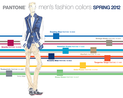 MENSWEAR COLORS MENSWEAR COLORS
Similar to the women's palette, men's hues take a bright and playful approach to spring 2012, with yellow and orange continuing to make a statement.
Brave, bold colors like Tangerine Tango and Solar Power are the perfect confidence boosters.
Combine them with Sodalite Blue for a more balanced look, or weave in warm neutral Starfish for a safer, more subdued look.
Spring and Summer naturally evoke feelings of calm ocean waters and tranquil beach vacations.
Vivid Hawaiian Ocean adds sparkle to any attire. Pair it with Dazzling Blue to lift basic blues to new heights.
Vintage Khaki, a timeless yet quintessential classic, is best paired with Granita, a full-bodied and robust deep red.
Breezy Tradewinds creates the perfect combination for spring with Dazzling Blue and Grass Green.
This sporty Tommy Hilfiger yet classic golf green is sure to be a hit in active sportswear. |
|
|
The 16 Spring 2012 Colors for Women and Men Are: |
 |
Tangerine Tango
PANTONE 17-1463
CMYK 0.83.95.0
GOE 20-1-5
PLUS 7625 |
 |
Sweet Lilac
PANTONE 14-2808
CMYK 3.26.0.0
GOE 29-2-2
PLUS 203 |
 |
Granita
PANTONE 19-2039
CMYK 6.98.37.25
GOE 26-2-5
PLUS 7425 |
 |
Solar Power
PANTONE 13-0759
CMYK 0.24.84.0
GOE 6-1-2
PLUS 1225 |
 |
Cockatoo
PANTONE 14-5420
CMYK 50.0.30.0
GOE 105-2-4
PLUS 3258 |
 |
Hawaiian Ocean
PANTONE 17-4540
CMYK 98.8.14.1
GOE 94-5-1
PLUS 632 |
 |
Bellflower
PANTONE 18-3628
CMYK 45.64.5.0
GOE 46-1-5
PLUS 7661 |
 |
Driftwood
PANTONE 18-1210
CMYK 38.39.40.26
GOE 165-2-6
PLUS 409 |
 |
Tradewinds
PANTONE 15-4307
CMYK 46.33.27.18
GOE 82-3-3
PLUS 430 |
 |
Cabaret
PANTONE 18-2140
CMYK 1.91.18.5
GOE 31-1-6
PLUS 7424 |
 |
Starfish
PANTONE 16-1120
CMYK 22.30.51.14
GOE 149-1-2
PLUS 7521 |
 |
Grass Green
PANTONE 15-6437
CMYK 52.0.66.0
GOE 121-1-3
PLUS 358 |
 |
Sodalite Blue
PANTONE 19-3953
CMYK 98.79.8.37
GOE 70-5-3
PLUS 534 |
 |
Dazzling Blue
PANTONE 18-3949
CMYK 92.57.0.0
GOE 69-1-7
PLUS 7670 |
|
 |
Margarita
PANTONE 14-0116
CMYK 30.7.51.1
GOE 127-3-1
PLUS 7493 |
 |
Vintage Khaki
PANTONE 16-0205
CMYK 32.31.39.17
GOE 165-2-5
PLUS 402 |
|
The colors featured in the PANTONE Fashion Color Report are culled from the PANTONE FASHION + HOME Color System, the most widely used and recognized color standards system in the world.
Each season, Pantone surveys the designers of New York Fashion Week and beyond to collect feedback on prominent collection colors, color inspiration and color philosophy. This information is used to create the PANTONE Fashion Color Report, which serves as a reference tool throughout the year for fashion enthusiasts, reporters and retailers.
For more information about the Pantone please visit www.pantone.com
For more information about the Pantone Goe System please read: www.fashiontrendsetter.com/~Pantone-Goe-System.html |
|
|
|
 |


 MENSWEAR COLORS


