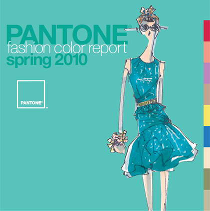
11/9/2009 - Pantone the global authority on color and provider of professional color standards for the design industries, announces the PANTONE Fashion Color Report Spring 2010.
PANTONE Fashion Color Report Spring 2010 features the top 10 colors for women's fashion for spring 2010, along with designer sketches, quotes and headshots, and is available free-of-charge.
The release of the PANTONE Fashion Color Report coincides with the beginning of New York Fashion Week.
"Now more than ever, women are vigilant when it comes to spending," said Leatrice Eiseman, executive director of the Pantone Color Institute.
"Instead of reinventing their wardrobe at the start of each season, consumers want pieces to complement what they already own. Pairing a bold color with a basic piece or freshening up their look with bright accents addresses the need for practicality, as well as fun."
In addition to designer contributions, this season's report also features commentary from fashion insiders and retail standouts regarding the current consumer consciousness toward fashion. |
The top 10 Spring 2010 colors for women are: |
 |
Turquoise
PANTONE 15-5519
C/M/Y/K 61 / 0 / 32 / 0
GOE 104-2-3C |
 |
Tomato Purée
PANTONE 18-1661
C/M/Y/K 13 / 99 / 70 / 0
GOE 26-3-1C |
 |
Fusion Coral
PANTONE 16-1543
C/M/Y/K 1 / 48 / 42 / 0
GOE 16-1-2C
|
 |
Violet
PANTONE 16-3320
C/M/Y/K 25 / 53 / 0 / 0
GOE 45-1-3C |
 |
Tuscany
PANTONE 16-1219
C/M/Y/K 25 / 35 / 41 / 0
GOE 16-4-1C |
 |
Aurora
PANTONE 12-0642
C/M/Y/K 4 / 5 / 72 / 0
GOE 2-1-3C |
 |
Amparo Blue
PANTONE 18-3945
C/M/Y/K 81 / 47 / 0 / 0
GOE 69-1-6C |
 |
Pink Champagne
PANTONE 12-1107
C/M/Y/K 1 / 10 / 20 / 0
GOE 147-1-1C |
 |
Dried Herb
PANTONE 17-0627
C/M/Y/K 45 / 31 / 65 / 10
GOE 153-1-3C
|
 |
Eucalyptus
PANTONE 15-0513
C/M/Y/K 26 / 22 / 40 / 0
GOE 153-1-1C |
|
Industry gurus highlighted in the report include Nina Garcia, fashion director at Marie Claire and judge on Lifetime's "Project Runway," Clinton Kelly, co-host of TLC's "What Not to Wear," and India Hicks, creative partner at Crabtree & Evelyn. Contributors from Neiman Marcus, Saks Fifth Avenue, Macy's and Links of London also weigh in from a retailer's perspective.
According to this season's report, vibrant brights add a sense of excitement to the palette, especially when set against practical neutrals that provide a safety net for cautious consumers.
Spring and summer naturally evoke feelings of calm ocean waters and tranquil beach vacations in cool, vibrant, tropical Turquoise. This soothing hue from the blue-green family conjures feelings of escape, especially when paired with Amparo Blue. With more warmth than the typical spring navy, this particular shade of blue is extremely appealing because of its brighter, more energetic attitude. Like the scent of a blossoming flower, Violet lends a romantic air to the warm-weather palette. This intriguing purplish hue is a distinctive addition to any wardrobe.
Yellow has made its mark on fashion and spring will further this trend with gleaming Aurora. Reminiscent of the first glimpse of yellow as the sun begins to rise over the horizon, this shimmering, slightly greenish yellow adds a bold infusion. Energy continues to surge throughout the warmer hues, leading to provocative Fusion Coral. This inviting orange connects directly to tangy Tomato Puree, this season's classic red. Pair it with Turquoise for a retro look.
Thoughtful, cautious neutrals provide a dependable backbone to the brights of spring. Kick back and enjoy the bubbly luxury of Pink Champagne. This delicate, wispy tint is the season's newest neutral. The melding of Pink Champagne, Tomato Puree and Amparo Blue is a refreshing take on the classic springtime combination of red, white and blue.
Three additional neutrals round out the palette. Tuscany, a warm beige hue, provides the perfect backdrop and works well as a solid base with dynamic accents like Fusion Coral or Violet. Dried Herb is the ultimate green neutral, pairing well with all other colors. Ideal for bigger ticket items, cool Eucalyptus is the eternal, practical gray. Choose this nuanced neutral and add brightly colored exclamation points in shoes, jewelry and handbags.
The colors featured in the PANTONE Fashion Color Report are culled from the PANTONE FASHION + HOME Color System, the most widely used and recognized color standards system in the world. Each season, Pantone surveys the designers of New York Fashion Week to collect feedback on prominent collection colors, color inspiration and color philosophy. This information is used to create the PANTONE Fashion Color Report, which serves as a reference tool throughout the year for fashion enthusiasts, reporters and retailers.
For more information about the Pantone Fashion Color Report Spring 2010 please visit:
www.pantone.com/spring2010
For more information about the Pantone Goe System please read:
www.fashiontrendsetter.com/~Pantone-Goe-System.html |


